Responsive blog landing page


Design comparison

Solution retrospective
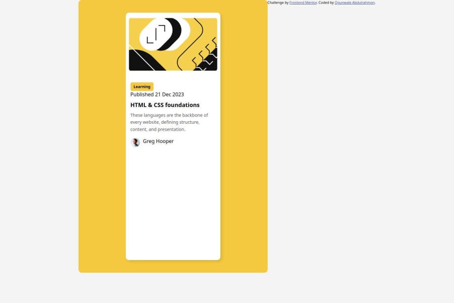
What I'm most proud of: I feel most proud of how the project came together with a clean and responsive design. The layout looks so good and well-structured, transitioning nicely across a range of screen sizes. I also like how I integrated the SVG illustration into the card to add such dynamism and visual flow to the design. Also, using flexbox to align an author's image and text showed my understanding of modern CSS layout techniques.
What I would do differently next time: The second time around, I'll make sure to consider available features regarding accessibility: this design's contrast and using keyboard navigation when working with interactive elements. One way to make the SVG illustration more performance-oriented would be optimization towards reducing its file size. Responsiveness I've used in my card, although interactivity regarding element hover state development, as well as transition effectivity, can still be made more effective in developing great user experience.
What challenges did you encounter, and how did you overcome them?-
Integrating the SVG illustration: The challenge was making sure the SVG illustration aligned with the rest of the content inside the card. Initially, it was difficult to make the illustration responsive without messing up the layout. How I overcame it: I changed the width and height properties of the SVG, then used
viewBoxso it could scale proportionally. I usedpaddingandborder-radiuson the SVG so that its corners would be smooth while responsive and look good across different devices. -
Aligning the author image with text: First tries, could not get the author's image and the name aligned in an appealing way considering different screen sizes. How I overcame it: I applied
flexboxto the author section, which allowed me to ensure the image and text were properly aligned horizontally and vertically. The flexibility offlexboxmade it possible for me to adjust spacing and alignment without adding extra complexity. -
Responsiveness at various devices: What gave me a headache was when I needed to make it look nice across devices, mainly small ones. How I overcame it: Media queries helped in tweaking padding, font size, and layout at different screen breakpoints. While testing on different devices, I had to make changes continuously so the card would look visually intact in adjusting to smaller screen size.
-
Design Consistency: Since the volume of CSS involved was huge, it was not easy to maintain consistent spacing, font sizes, and colors between different components. How I overcame it: I tried following a design system approach wherein all the padding and margins are given according to an accurate measurement basis, with an exact scheme for color schemes leading to fonts. This helps to maintain consistency for a clean, organized look and feel in your card.
These challenges helped in sharpening my skills, generally speaking, with responsive design, SVG handling, and layout techniques that made a much better final result possible.
What specific areas of your project would you like help with?-
Advanced Accessibility Improvements: While I have included basic improvements to make the card more accessible, further guidance on how to make the card fully accessible will be greatly appreciated. Concretely, I am looking for advice on how to provide better contrast, implement ARIA attributes, and ensure keyboard navigation flows smoothly.
-
SVG Optimization: I'd love some suggestions on how I might optimize this SVG for performance. This works, but I'm wondering if there are specific techniques or tools to take SVGs and make them the smallest they can be for use in mobile devices.
-
Hover and Transition Effects: I want the card to be more interactive with hover and transition effects. Advanced CSS techniques should be used to make the card more engaging without complicating the layout or affecting performance.
-
Dynamic Content Integration: I’m considering integrating real blog data dynamically into the card using JavaScript or an API. I’d like help with how to fetch and display dynamic content from an external source (like a CMS or API) and how to structure the content efficiently.
-
Mobile-first Design Considerations: Although the card is already responsive, I would like to know how I can further improve the approach towards mobile-first design. Are there other best practices or strategies I could apply in improving mobile performance and usability?
These are areas where I feel I need to improve my approach, and further advice or resources to enhance the project will be highly appreciated.
Community feedback
- @WesSnoPosted about 2 months ago
Hello @moyinoluwa001, congratulations on completing this project 🎉.
Accessibility Best Practices
First off, I have some tips that I believe could help improve the accessibility of your project.
- You could begin by wrapping your card in a landmark element such as the <main></main> tag.
- This <main></main> tag designates the primary content of the page.
- Assistive technologies, like screen readers, allow users to navigate directly to the <main> content.
- Therefore the <main> can take the place of the <div class="card-container">
- While doing so, you can also wrap the <div class="attribution"></div> in another landmark element, <footer></footer> tag to be precise.
- This tag is normally used to contain information about the author and other contact information on the page.
HTML
For the HTML, instead of <span>, it is <san
CSS
I have seen that there are some few issues with the CSS of the page.
- CSS for the body element should be:
body {
display: flex;
flex-direction: column; /* To ensure all elements (flex items) are stacked vertically */
justify-content: center;
align-items: center; /* to center all elements */
height: 100vh; /* To ensure the body's height is set to 100% of the viewport height (fills the entire screen vertically) */
background-color: yellow; /* You will find the colors to use in the style guide that is in the folder */
}

/* For the author info section */
.author{
display: flex;
text-align: center;
gap: 10px;
align-items: center; /* so that the name aligns at the center with the author image */
         }
You can apply these tips to your code to enhance accessibility and aesthetics.
Hope I have been helpful.
0@moyinoluwa001Posted about 2 months ago@WesSno yes I really appreciate it, thanks so much
0 - You could begin by wrapping your card in a landmark element such as the <main></main> tag.

Please log in to post a comment
Log in with GitHub
Join our Discord community
Join thousands of Frontend Mentor community members taking the challenges, sharing resources, helping each other, and chatting about all things front-end!
Join our Discord