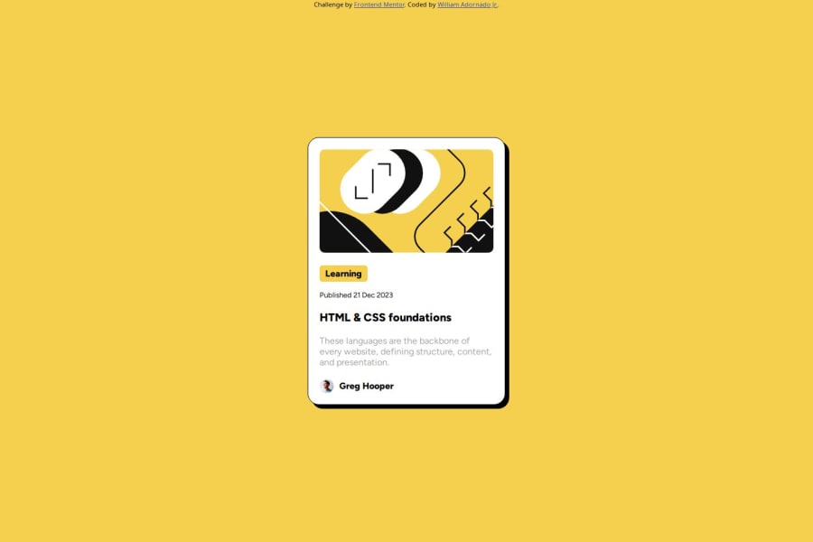
Design comparison
Solution retrospective
Creating a card without using a framework design like bootstrap and tailwind. I would differently be next by adding more difficulty by using sass (style processor) to also avoid nesting name :)
What challenges did you encounter, and how did you overcome them?The challenge I encounter one of them is the font size of the text as it need to be accurate to preview image it shows in term to mobile or desktop without using Figma for reference. I overcome this to overlaying the image of the preview to my design to replicate the text also the same of what font-weight and font-family it uses.
What specific areas of your project would you like help with?How to make responsive if the card become to many without aligning them into 1 card each? Is it possible to happen (also without affection too much the size)??
Please log in to post a comment
Log in with GitHubCommunity feedback
- @darbata
Nice your code structure looks very good. Your HTML file is clear and uses semantic tags appropriately. In your CSS file you used variables well.
Join our Discord community
Join thousands of Frontend Mentor community members taking the challenges, sharing resources, helping each other, and chatting about all things front-end!
Join our Discord
