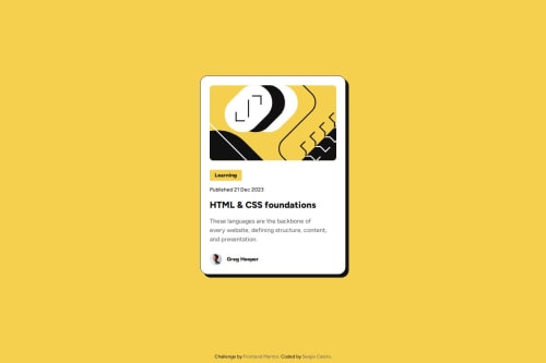
Submitted about 1 year agoA solution to the Blog preview card challenge
Responsive Blog Card with Scss and fluid typography
sass/scss, bem
@SergioCasCeb

Solution retrospective
What are you most proud of, and what would you do differently next time?
As a very simple challenge there is not much to talk about, but it was a nice reminder how fluid typography can spare you the work of adding media queries for responsiveness.
What challenges did you encounter, and how did you overcome them?None.
What specific areas of your project would you like help with?Honestly I don't want any help in specific, but I am more than happy to improve my approach if there is any feedback. :D
Code
Loading...
Please log in to post a comment
Log in with GitHubCommunity feedback
No feedback yet. Be the first to give feedback on Sergio Eduardo Castro Ceballos's solution.
Join our Discord community
Join thousands of Frontend Mentor community members taking the challenges, sharing resources, helping each other, and chatting about all things front-end!
Join our Discord