Design comparison
Solution retrospective
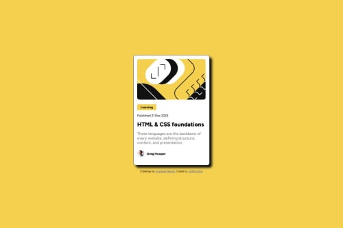
The designing of the project has been very challenging to me and I need help with the box shadow
What challenges did you encounter, and how did you overcome them?Just designing it and making the box shadow
What specific areas of your project would you like help with?creating that smooth box shadow
Community feedback
- @gmagnenatPosted 5 months ago
Hi, congrats on completing the challenge !
I have a security warning when trying to access your live url in Firefox and Chrome so I will only comment on what I see on github
I have a few comments that can help you improve this solution and hopefully help you for your future projects.
Does the solution include semantic HTML? a few issues here.
- Add the title in the head very high that's a performance best practice Link to ressources about this on Discord
- you need to have a
<main>
landmark. it is missing in this solution - the
<button>
doesn't have a proper use I think here. It should be just an information about the category so a <p> tag or a link to a category archive in that case an <a> tag. - Don't skip heading orders. H1, H2, H3 etc. skipping order can be missleading and bring confusion on what is the main title.
- Don't mention image in images alt tag. There is a great ressource about how to write alt in the ressources forum on Discord.
- this is a blog preview card that si probably ment to link to a full blog post page. In my opinion it needs a link. Think about a real life scenario, where would you put this card and how would you use it?
Is it accessible, and what improvements could be made?
- Why font-size must NEVER be in pixels. You need to use relative units for everything related to fonts and sizes. Your layout needs to scale correctly if the user change its browser default settings.
- Don't set a fixed height on the card it will cause display problems. Just control it's max-width in relative units. Let it scale correctly with the content.
- You don't need to set a size on the card header like you did. let it fill the whole width of the card and just add padding to the card.
- a fixed width on your button will cause problem as well. let it be scalable with it's content with a
max-width: fit-content
for example.
Does the layout look good on a range of screen sizes? Not tested.
Is the code well-structured, readable, and reusable? Some improvement can be made in markup (heading orders) And I would use more classes on elements instead of targeting the element in the container. Like this it will be more readable and maintainable.
card_title
instead ofcard_container h2
for example.Does the solution differ considerably from the design? By the comparison window, it looks quite close.
- The box shadow blur to remove.
- I don't see in the code any hover for the interactive elements.
I hope this helps you improve your solution and your future projects.
Happy coding !
0 - @ShoaibShujaPosted 5 months ago
This will create the box shadow you want my friend: box-shadow: 10px 10px; The problem was that the third 10px that you added was adding a blur to the shadow and don't set a color because the default color is black and black colored shadow is used in this challenge. Hope this helps and have a beautiful day.
0
Please log in to post a comment
Log in with GitHubJoin our Discord community
Join thousands of Frontend Mentor community members taking the challenges, sharing resources, helping each other, and chatting about all things front-end!
Join our Discord