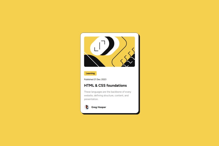
Design comparison
Solution retrospective
This is my first responsive project, with more attention to the margins and paddings than the previous one ! I've really enjoyed this one as it was more complex and made me Google a thing or two so I learnt a lot with it.
What challenges did you encounter, and how did you overcome them?Here is what I learned during this project:
- Using @font-face to import custom fonts
- Better understanding of the Flexbox model
- How to make a container responsive
I didn't manage to have the left and right margins of 24px when viewed on mobile, if I did put margin: 0 1.5rem, i had the margin on the left side only and the right side was cropped, any ideas ? Thank you
Community feedback
- @LANRIE-DEVPosted about 1 year ago
I would like to commend you on a job well done. 👍👍
I would love to make a few suggestions.
-
⭐️ Great job using semantic HTML! Such widgets as cards are more suited to be constructed with the <article> element, which encapsulates reusable, self-contained content.
-
You didn't include the transition property for the active state for the heading (HTML and CSS foundations)
This is mine 👇👇:
<h1 class="main heading">HTML & CSS foundations</h1>The styling below 👇👇:
`. main heading { font-size: 1.5rem; font-weight: 800; display: inline-block; margin: 1.1rem 0; transition: color 0.2s ease; }
. main heading: hover { color: hsl(47, 88%, 63%); cursor: pointer; }`
Again, well done and thumbs up. 👍
Marked as helpful1@MaxCodeCraftPosted about 1 year ago@LANRIE-DEV Thank you for this feedback, much appreciated !! I will correct this tomorrow !
0 -
- @Geox2bPosted about 1 year ago
Looks great, one tip, I would also translate the card itself a bit upwards so it really feels like the card is coming towards the use, kinda like the user is picking up the card.
0 - @stephenkjohnstonPosted about 1 year ago
Hello @MaxCodeCraft, You did a great job matching the design and your code looks great. Keep up the good work!
I do have a couple suggestions:
- Consider using the
<time>MDN Article. The only real benefit to this is it can improve accessibility for impaired users.
0 - Consider using the
Please log in to post a comment
Log in with GitHubJoin our Discord community
Join thousands of Frontend Mentor community members taking the challenges, sharing resources, helping each other, and chatting about all things front-end!
Join our Discord
