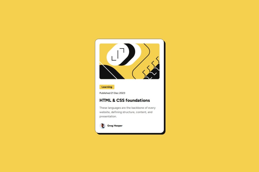
Design comparison
Solution retrospective
This is my first time doing mobile first for my website, I used media query to resize the font size in bigger screens. Next time I am thinking that it would be better to use clamp instead of media query to resize the font
There is also 2 ttf font files I could have used, but I instead just linked the font needed from google font, maybe it would be better to also make use of the font files
What challenges did you encounter, and how did you overcome them?Main issues came from responsiveness, the blog-card overflowed in mobile view. And then I realized its because I don't have my image as max-width 100%, I also used max-width instead of just width for my card which made which also helped me a ton in my code
If there are better ways to help with the responsiveness then I would like to know
What specific areas of your project would you like help with?I still feel I am writing more code than needed, would like for tips on how to reduce my code, also if my approach is right in general and general reminders on how to improve my code
Also one more thing, in the Figma file, in the design system there is the spacing section below.
It got 4px 50 8px 100 12px 150 16px 200
Not sure I understand what they mean by 50, 100, 150, 200
Is that just suggestion on what to name your spacing in your custom properties or is it something else?
Join our Discord community
Join thousands of Frontend Mentor community members taking the challenges, sharing resources, helping each other, and chatting about all things front-end!
Join our Discord
