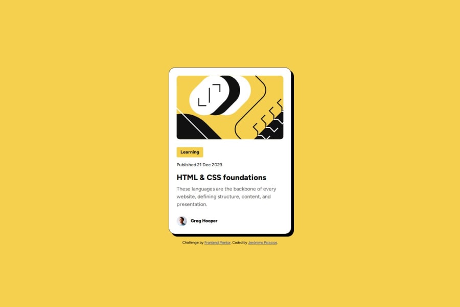
Design comparison
Solution retrospective
I've been able to work through the Figma template much more comfortably. I have adopted an outside in approach, working my way from the bigger stuff to the smaller stuff quite successfully.
What challenges did you encounter, and how did you overcome them?Adapting the font size and the card size depending on the device without using media queries posed a challenge. With some help from my favorite LLM I found the clamp property for the fonts and the max-width(,vw) property that helped me overcome it.
What specific areas of your project would you like help with?Any feedback would be appreciated. From the choice of flexbox for displaying the CSS to the solutions to overcome the viewport challenges.
Community feedback
Please log in to post a comment
Log in with GitHubJoin our Discord community
Join thousands of Frontend Mentor community members taking the challenges, sharing resources, helping each other, and chatting about all things front-end!
Join our Discord
