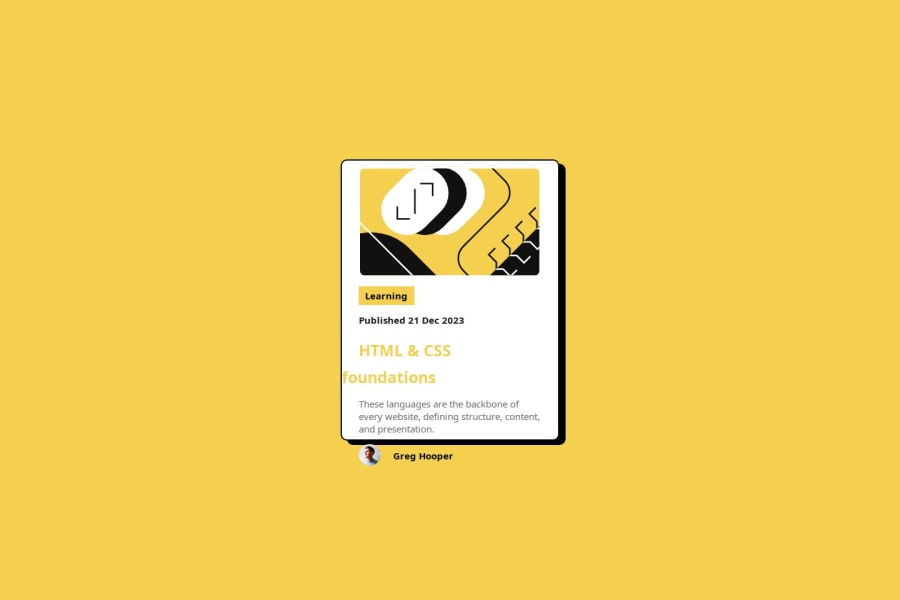
Responsive blog card using flex box
Design comparison
Solution retrospective
finally i recreated solution with flex-box. in this i learnt about box shadow & concepts of pseudo (hover & focus). next time i will use it in my projects.
What challenges did you encounter, and how did you overcome them?i faced challenge in creating box-shadow for the card . i go through mdn document understand concept of box shadow.
Please log in to post a comment
Log in with GitHubCommunity feedback
- @Hasani-Sediqa
will done, for a better layout, you can use padding: 20px; to add space inside the card. Also, increase the height and width to make sure all the content fits nicely.
Keep practicing, and you'll succeed. Trust the process and believe in yourself!
Join our Discord community
Join thousands of Frontend Mentor community members taking the challenges, sharing resources, helping each other, and chatting about all things front-end!
Join our Discord
