Design comparison
Community feedback
- @hunterhuniPosted 8 months ago
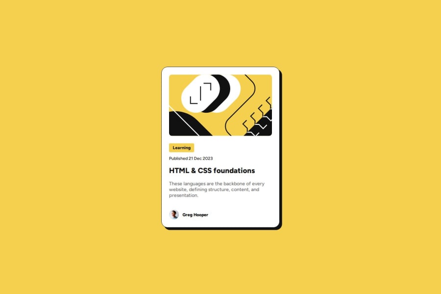
Apart from the line height of the description text I think that your implementation is spot on. Good work :)
Another thing that I would add here, since I saw that you mainly used IDs to target your HTML elements: https://dev.to/clairecodes/reasons-not-to-use-ids-in-css-4ni4
Marked as helpful0@fastcheetahPosted 8 months agoIf you reply to this tell me how you make your project so accurate fellow Igbo @hunterhuni
0@chiamakauyannaPosted 8 months ago@fastcheetah I used the Figma design. if you are able to access the Figma design, the width, height, padding and everything you need is there. just click on the frame you need and you can find the exact stylings used.
0@chiamakauyannaPosted 8 months agoJust the first two projects were accessible so I was able to get the exact styling @fastcheetah
0
Please log in to post a comment
Log in with GitHubJoin our Discord community
Join thousands of Frontend Mentor community members taking the challenges, sharing resources, helping each other, and chatting about all things front-end!
Join our Discord
