

Design comparison

Solution retrospective
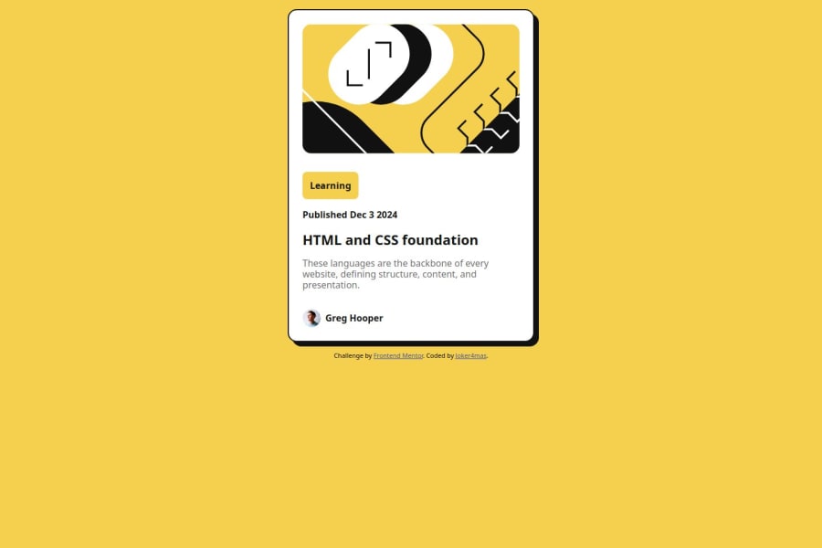
Trying out this challenge was exciting as I had to look up concepts like box-shadow and CSS variables to help me get as close to designing the card as possible.
Community feedback
- @BlenimatorPosted 3 months ago
Hey there! Think overall this is looking good so far!
Just thought that you might wanna double check the size and placement of your card. It seems to be slightly off center and it stretches out on bigger monitors.
Maybe you could consider adding a max-height/width for the .container class? I am not sure if the children would then inherit this, but maybe worth a try though.
I do belive if you add a a height: auto; to your .container, it should be placed in the center of the screen vertically as well.
For the .css itself, i probably would order things a bit different, like i'd put the .attribution to the bottom right before the media queries - but that's for my personal taste (just looking at the page from top to bottom and would arrange the css the same way if possible).
Not sure if this would be a better practice or not, but maybe consider defining your color variables in the .root class and use it with names? Might be easier to read when you come back to your code later.
Just my 2 cents. Hope it makes some sense and helps. Cheers!
0

Please log in to post a comment
Log in with GitHubJoin our Discord community
Join thousands of Frontend Mentor community members taking the challenges, sharing resources, helping each other, and chatting about all things front-end!
Join our Discord