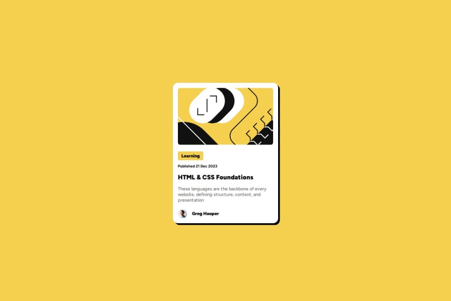


Design comparison

Solution retrospective
I am very proud that I was able to create a site that looks good on both desktop and mobile. I am also very proud of how simular the end result ended up looking to the example.
What challenges did you encounter, and how did you overcome them?My biggest challenge was figuring out the description text. I had issues trying to get it to wrap and still look right. Eventually, I managed to get it looking right but when I hosted the site on git hub pages I discovered that my solution did not work. So I had to again look for another solution. Eventually, I found one that worked on git hub pages.
What specific areas of your project would you like help with?In this project, I used rem for basically everything is that the correct thing to do? Also any advice on what I can do to improve accessibility would be fantastic.
Community feedback
Please log in to post a comment
Log in with GitHub
Join our Discord community
Join thousands of Frontend Mentor community members taking the challenges, sharing resources, helping each other, and chatting about all things front-end!
Join our Discord