

Design comparison

Solution retrospective
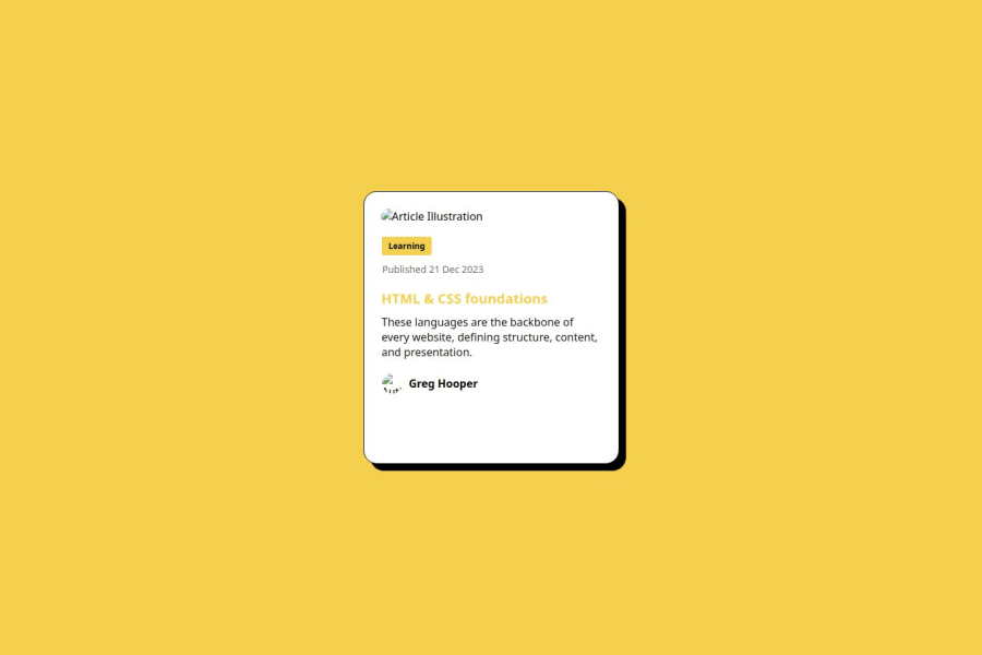
I am proud of successfully completing the Blog Preview Card using only HTML & CSS and also improving my layout structure and understanding of semantic HTML.
I will use more CSS techniques like flexbox or grid to reduce extra code
What challenges did you encounter, and how did you overcome them?The author’s image wasn’t showing because I mistakenly used .png instead of .jpg it was frustrating and took a lot of time but I carefully checked the file format and updated the correct extension. And felt releaved I wasn’t sure if the thin black line around the card was a border or a box-shadow so I experimented with both CSS properties and found that a border: 1px solid black; worked best.
These challenges helped me learn and improve, and I’ll be even better in my next project
What specific areas of your project would you like help with?Did I use semantic HTML correctly, or is there room for improvement? Does my design work well on all screen sizes, or should I tweak something? Could I use better CSS methods (like Flexbox/Grid) to improve my layout?

Join our Discord community
Join thousands of Frontend Mentor community members taking the challenges, sharing resources, helping each other, and chatting about all things front-end!
Join our Discord