Design comparison
Solution retrospective
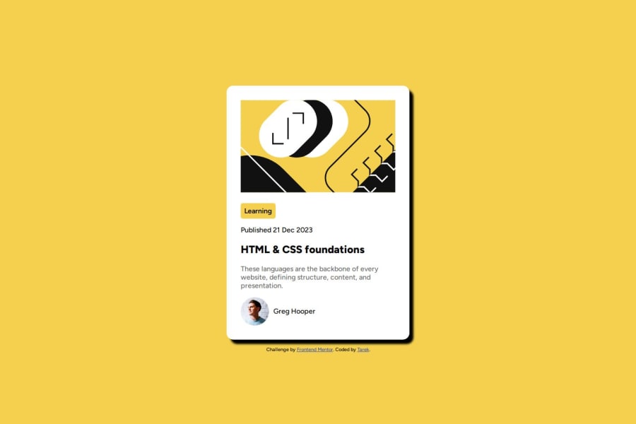
I learned how to have image take up all the width of parent container. I also learned how to create box shadow.
What challenges did you encounter, and how did you overcome them?I encountered challenge in when I created a span element to hold the "Learning" word. I was trying to create margin but I didn't realize inline elements only allow horizontal margins and not vertical.
Community feedback
- @gillaercioPosted 5 months ago
Despite the absence of a rounded border and shading on the card as requested by the challenge, I'm sure that this part with the details will improve over time.
It was a competent project, congratulations.
0
Please log in to post a comment
Log in with GitHubJoin our Discord community
Join thousands of Frontend Mentor community members taking the challenges, sharing resources, helping each other, and chatting about all things front-end!
Join our Discord
