Not Found
Not Found
Not Found
Not Found
Not Found
Not Found
Not Found
Not Found
Not Found
Not Found
Not Found
Not Found
Not Found
Not Found
Not Found
Not Found
Not Found
Not Found
Not Found
Not Found

Submitted

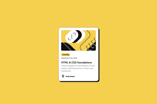
Responsive Blog Card Component

P
Rahul Das 30

@krkfpo

Desktop design screenshot for the Blog preview card coding challenge

This is a solution for...

  • HTML
  • CSS
1newbie
View challenge

Design comparison


SolutionDesign

Solution retrospective


What are you most proud of, and what would you do differently next time?

After getting valueable inputs from @Islandstone89 I have tried to follow his instructions. In this project I have used semantic HTML and Responsive CSS techniques.

What challenges did you encounter, and how did you overcome them?

To be Honest, Semantic HTML and structuring the CSS file so that there is no redundant style was a challenge. I have structured the CSS file so that the rule sets are grouped based on the elements they are applied for my own understanding.

What specific areas of your project would you like help with?

Dear Mentors, Thank you for your valuable input last time. I would seriously need your help in assessing my skill of basic HTML and CSS and guide me further. Please give me a feedback after assessing this project . Thank you.

Community feedback

P

@Islandstone89

Posted

Hi! I'm glad you've found my previous suggestions helpful. Good job on this project, I like your use of Custom Properties and font sizes in REM.

Here is my feedback for this challenge:

HTML:

  • Every webpage needs a <main> that wraps all of the content, except for <header> and footer>. This is vital for accessibility, as it helps screen readers identify a page's "main" section. Wrap the card in a <main>.

  • I would change the heading ("HTML & CSS") to a <h2> - a page should only have one <h1>, reserved for the main heading. As this is a card heading, it would likely not be the main heading on a page with several components.

  • You don't need to wrap the top image in a <div>.

CSS:

  • Including a CSS Reset at the top is good practice.

  • I would add 1rem of padding on the body, to ensure the card doesn't touch the edges on small screens.

  • Remove the margin on body.

  • Remove min-height and max-height on the card. We never want to limit the height of elements containing text - if the content inside of the card grows to be taller than the max-height, it will cause overflow. And there is no need for a min-height - the content, along with margin and padding, should determine the size of the card. The only thing needed is the max-width, so it doesn't stretch indefinitely on larger screens.

  • Remove all image styles, except for:

max-width: 100%;
border-radius: 10px;
margin-bottom: 1.5em;

Keep up the good work!

1

P
Rahul Das 30

@krkfpo

Posted

Once again thank you so much sir for these invaluable suggestions🙇.I have tried to follow your advice and hopefully won't disappoint you this time😅.Am always open for any kinda suggestions and feedbacks@Islandstone89

1
Hamid Riaz 150

@hamidriaz1998

Posted

Congrats on solving the problem! Keep growing

1

P
Rahul Das 30

@krkfpo

Posted

Thanks buddy, wish you the same@hamidriaz1998

0

Please log in to post a comment

Log in with GitHub
Discord logo

Join our Discord community

Join thousands of Frontend Mentor community members taking the challenges, sharing resources, helping each other, and chatting about all things front-end!

Join our Discord