Submitted about 1 month ago
Responsive blog card challenge with FlexBox and Media queries.

@YAlkhous

Design comparison
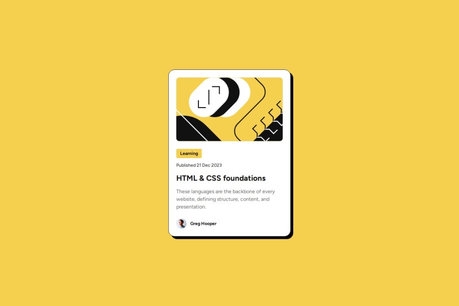
SolutionDesign

Solution retrospective
What challenges did you encounter, and how did you overcome them?
This is the first time i use @media queries, it wasn't difficult at all , but i couldn't resize the image correctly. After moving to the size of Mobile the image becomes smaller and some space under and over the picture.
What specific areas of your project would you like help with?I want some help in resizing images.
Community feedback
- @altugbozyaka2005Posted about 1 month ago
Great work, good attempt in using the media queries and good use of variables. I definitely learned something from your text-preset variables setup. I dont know if using 2 divs to cover the learning tag was necessary.
Marked as helpful0

Please log in to post a comment
Log in with GitHub
Join our Discord community
Join thousands of Frontend Mentor community members taking the challenges, sharing resources, helping each other, and chatting about all things front-end!
Join our Discord