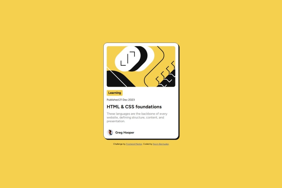
Not Found
Not Found
Not Found
Not Found
Not Found
Not Found
Not Found
Not Found
Not Found
Not Found
Not Found
Not Found
Not Found
Not Found
Not Found
Not Found
Not Found
Not Found
Not Found
Not Found

Submitted

Responsive blog card

@KevinBermudezC

Desktop design screenshot for the Blog preview card coding challenge

This is a solution for...

  • HTML
  • CSS
1newbie
View challenge

Design comparison


SolutionDesign

Solution retrospective


What are you most proud of, and what would you do differently next time?

Well, I'm really proud that I was able to do it, I thought it was really difficult but I did it, and I'm really happy about it. I will use frameworks next time.

What challenges did you encounter, and how did you overcome them?

Well, this time how to organize the card with the boxes and all that was the difficult part.

What specific areas of your project would you like help with?

I think its a little bit wider that the original.

Community feedback

@DylandeBruijn

Posted

@KevinBermudezC

Hiya! 👋

Congratulations on your solution, it looks very close to the design! I can tell you put a lot of effort into it.

Things I like about your solution 🎉

  • Use of semantic HTML elements
  • Clear descriptive CSS classes
  • Use of CSS custom properties

Things you could improve ✍️

  • I suggest adding a bit of padding to your body element so the card has some space around it on smaller viewports.

  • You could add a min-height: 100vh to your body element so it takes up the full height of the viewport while still being able to grow when the content inside it grows.

  • Try experimenting with CSS variables, they help you make your CSS values more reusable across your code.

  • Try making your solution responsive.

  • position: relative is not necessary on your card.

  • Try using relative CSS units like rem and em.

  • Be careful with setting a fixed height and width on an element, this will cause overflow issues. Example:

.category {
    background-color: var(--primaryYellow);
    padding: 4px 8px;
    border-radius: 4px;
    font-weight: bold;
    width: fit-content;
    height: 29px;
}

Try putting more text in the .category element and you'll see the problem.

I hope you find my feedback valuable, and I would appreciate it greatly if you could mark my comment as helpful if it was! 🌟

Let me know if you have more questions and I'll do my best to answer them. 🙋‍♂️

Happy coding! 😎

Marked as helpful

1
P
Han 430

@GamerSubhan

Posted

Everything looks good, except right and bottom borders are small, your blog image is bigger , and background div is smaller than actual. If you make these alignments then it's perfect!

1

Please log in to post a comment

Log in with GitHub
Discord logo

Join our Discord community

Join thousands of Frontend Mentor community members taking the challenges, sharing resources, helping each other, and chatting about all things front-end!

Join our Discord