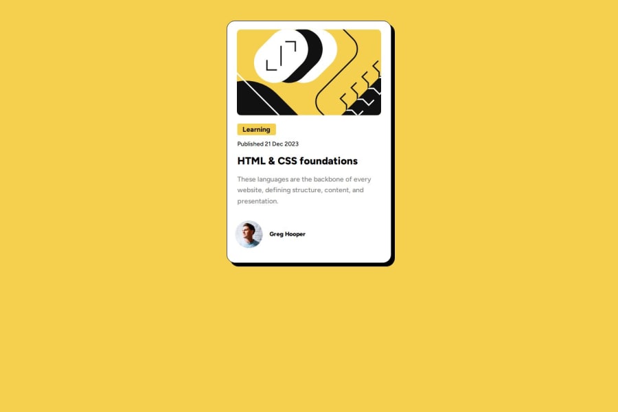
Responsive Blod Review Card using HTML and CSS only
Design comparison
Solution retrospective
I used *{} to style the entire html. its easier that way because it tends to give the page a default styl.
What challenges did you encounter, and how did you overcome them?the class and id's to be styles was quite confusing but i learnt to style them diferently and sectioned the divs.
What specific areas of your project would you like help with?all areas, especially styling the container and card class.
Community feedback
- @SvitlanaSuslenkovaPosted 6 months ago
-
body { display: flex; flex-direction: column; justify-content: center; align-items: center; min-height: 100vh; } Try this to align(top-bottom) and justify(left-right) your project to the center. It applies to the parent component(body), don't forget about !!min-height!!. You can use grid instead of flex too.
-
section id=preview-card-container - use <main> tag here. main {css} (without dot)
-
use class for styles, not id
Marked as helpful0@backendfrontflipPosted 6 months agoThank you for your observation, I’ll surely do that and update it@SvitlanaSuslenkova
0@backendfrontflipPosted 6 months agoHow can I work with you on projects ?@SvitlanaSuslenkova
0 -
Please log in to post a comment
Log in with GitHubJoin our Discord community
Join thousands of Frontend Mentor community members taking the challenges, sharing resources, helping each other, and chatting about all things front-end!
Join our Discord
