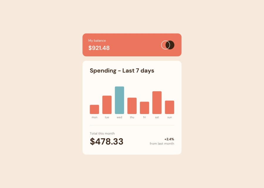
Design comparison
Solution retrospective
The next time I won't forget instead of "height:100vh" I should set "min-height:100vh" (for body element to show as expected in responsive mode) I added animation to the chart but since container's height is not fixed (fit-content) the whole chart is animated not just bars,which i found cool!
What challenges did you encounter, and how did you overcome them?Initially it seemes quite easy to me but as I progressed challenges started to show up. Positioning was first challenge because i was trying to center the chart both vertically and horizontally. Initially i set "height:100vh" (of body) but when on responsive mode it was shrinking. The solution was "min-height:100vh". Another challenge was chart scale. My solution was to find the maximum value and devide other values by max .
What specific areas of your project would you like help with?Positioning and scaling (assigning relative heights to bars)
Community feedback
Please log in to post a comment
Log in with GitHubJoin our Discord community
Join thousands of Frontend Mentor community members taking the challenges, sharing resources, helping each other, and chatting about all things front-end!
Join our Discord
