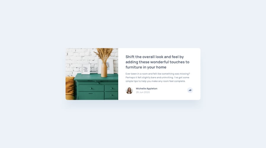
Design comparison
Solution retrospective
Any feedback would be greatly appreciated. Thank you!
Community feedback
- @A-amonPosted over 3 years ago
Hello! Great work, so is the responsiveness.
I think using a button for .share would be much better. It will let screen reader users know it's a button to be clicked on. You could also try using checkbox instead (You can use CSS combinator to toggle showing/hiding .social-icons instead of using JS) but I am not sure if it's suitable, especially when told to screen reader users.
Seems like you are using margin to vertically align each item in .social-icons. Flexbox has a CSS align-items property for it.
Marked as helpful0 - @jorsuapPosted over 3 years ago
good job, you just need to align vertically
Marked as helpful0@sandyivanPosted over 3 years ago@jorsuap I appreciate it :) Thanks, Jorddl!
0 - @palgrammingPosted over 3 years ago
Looks good but you need to work on the vertical alignment of the social icons the Twitter logo is not vertically centered when compared to the others
Marked as helpful0@sandyivanPosted over 3 years ago@palgramming got it, I did not notice that. Thanks for pointing that out. Thanks, Patrick!
0 - @sandyivanPosted over 3 years ago
Appreciate all the feedback guys! Thank you :)
0
Please log in to post a comment
Log in with GitHubJoin our Discord community
Join thousands of Frontend Mentor community members taking the challenges, sharing resources, helping each other, and chatting about all things front-end!
Join our Discord
