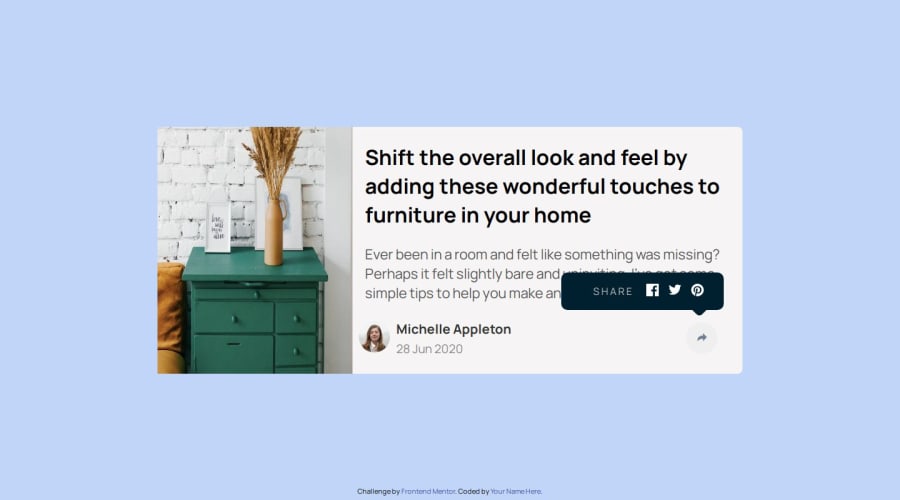
Design comparison
SolutionDesign
Solution retrospective
What are you most proud of, and what would you do differently next time?
.
What challenges did you encounter, and how did you overcome them?.
What specific areas of your project would you like help with?.
Community feedback
- @sonuk430Posted 12 months ago
One issue in the UI is with the responsive design: when the user clicks on the share button, the user name and image are hidden. Here are some CSS position adjustments for better user experience.
Marked as helpful0
Please log in to post a comment
Log in with GitHubJoin our Discord community
Join thousands of Frontend Mentor community members taking the challenges, sharing resources, helping each other, and chatting about all things front-end!
Join our Discord
