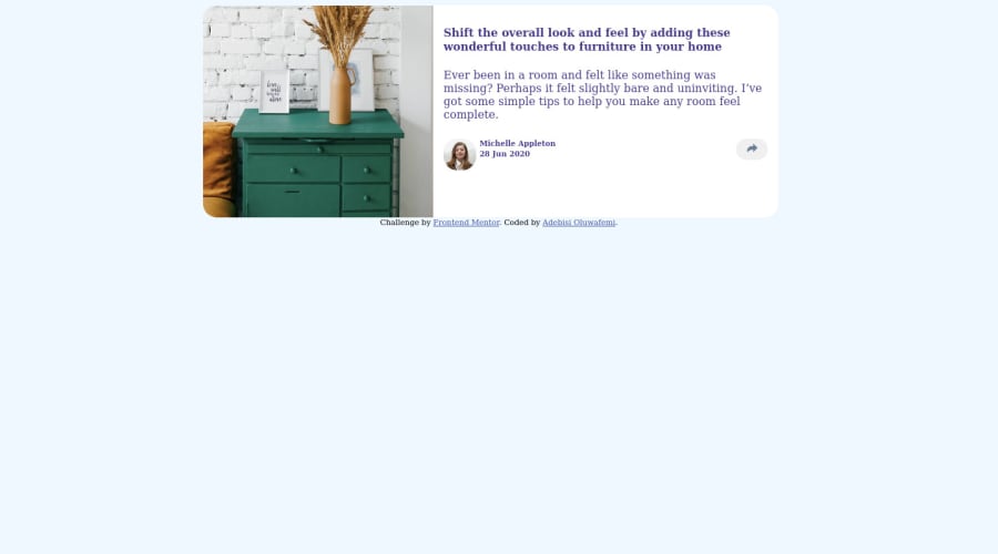
Design comparison
SolutionDesign
Solution retrospective
A feedback on how to make the mobile design bottom filled with the share button and still show the share button. Also how to make the share button more responsive
Community feedback
- @afrusselPosted over 3 years ago
- in desktop your main container is not center align.
- in mobile view container is not main box is not fit in width. Please take a look of my solution it may help you to find out your issues
2@AlbusflamesPosted over 3 years ago@afrussel . Alright.this is appreciated will look into it
0
Please log in to post a comment
Log in with GitHubJoin our Discord community
Join thousands of Frontend Mentor community members taking the challenges, sharing resources, helping each other, and chatting about all things front-end!
Join our Discord
