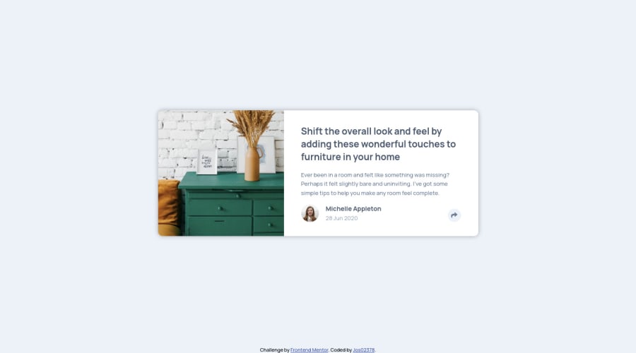
Responsive article preview using HTML, CSS, and Javascript
Design comparison
Solution retrospective
Hi everyone! I have some questions for my solution:
- Is there a better way to get the same size of the image without explicitly setting the width of the image?
- Is there any suggestion on how I can improve this solution?
Thank you!
Community feedback
- @pikapikamartPosted over 3 years ago
Hey, good work on this one. Both desktop and mobile layout is good and no responsive issues. The functionality works as well on the toggler.
Regarding your questions:
- Yep, other way on this could be. Since the
article
that wraps the element is a flexbox, you can set theflex-basis
of thediv
that holds the image withflex-basis: 285px
(convert it to rem okay:>). Then theimg
will have awidth: 100%
. But by doing this, the right item of the flexbox will now occupy more spacing, thus violating the285px
flex-basis
. Now, to solve this, use aflex-basis: calc(100% - 285px)
on the rightdiv
of the flexbox. This will make the right div to only have have that size and usingflex-basis
on flexbox items is really good instead of specifying a explicit width or height. - Suggestions below :>
- the
alt
text on theimg
should have been left empty since that image is pure decorative purpose. Only add aalt
text if you think that animg
adds to the content. - the
alt
text of the person's image should only have the name of that person, on this casealt="Michelle Appleton"
. Also, if you are adding aalt
text to an img or anaria-label
to any graphics, do not include the word"logo image icon"
anything that relates to image. The reason is that, screen reader will handle that for you.
For example. I add an
alt
text like this:alt="dog image"
. A screen reader will read this as "dog image graphic", screen reader will add the word "graphic" to any graphic content on a website. So that is why, we don't need to add those words. We should leave it asalt="dog"
.- the name of person as well as the date could have been wrapped inside a single
h2
tag.
<h2> {name of the person} <span>{date}</span> </h2>
- the toggler of the social media links should have used a
button
element instead of div. If there are interactive elements, especially when an element is supposed to be click, use abutton
. It adds extra accessibility and semantics to your structure. Along with thearia-expanded
attribute. This are for screen readers, you can search it up. - the social media links should have been wrapped inside their own
a
tags since they are supposed to be links.
<a aria-label="facebook"> # change aria-label according to the social media <i></i> </a>
Aside from those, good work on this one. Really.
Marked as helpful1@Jos02378Posted over 3 years ago@pikamart Thank you for your feedback, I really appreciated it! I was able to learn a lot from your comment.
0 - Yep, other way on this could be. Since the
Please log in to post a comment
Log in with GitHubJoin our Discord community
Join thousands of Frontend Mentor community members taking the challenges, sharing resources, helping each other, and chatting about all things front-end!
Join our Discord