Submitted almost 3 years ago
Responsive article preview compont
@francismudzungayiri
Design comparison
SolutionDesign
Solution retrospective
please feel free to review my project, any feedback is valued
Community feedback
- @pikapikamartPosted almost 3 years ago
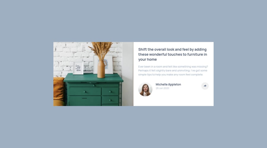
Hey, awesome work on this one. Desktop layout looks fine I guess but the background-color of the site doesn't match the design. Also you are missing those rounded corners on the article. The site is responsive though which is nice and the mobile state looks fine as well.
Some other suggestion would be:
- Avoid using
height: 100vh
on a large container like thebody
as this makes the element's height capped based on the viewport/screen's height. Instead usemin-height: 100vh
so that the element will expand if it needs to. overflow: hidden
on thebody
tag is not needed as well.- Always remember that when creating a site, you need to make use of
main
tag to wrap the main-content of the site so that it will be easier for other users to navigate your site. On this one, change thesection
into usingmain
. - Add an extra
aria-hidden="true"
on the image on the left side so that it won't be picked up by screen-reader. - Avoid using
id
to target and style an element since it is a bad practice due to css specificity. Instead, just useclass
to target element. - Also, you are missing the
h1
on the site. For this one, since there are no visible text that are suitable to beh1
, theh1
would be a screen-reader only heading. Meaning it will be hidden visually but present for screen-reader users. On this, theh1
would have likesr-only
class and the text-content should describe what is the main-content is all about. Theh1
could be placed as the first text inside themain
.Have a look at this simple snippet that I have that implements screen-reader h1. Comments are already included as well but if you have any questions about that one, just let me know:> - Person's image should be using the person's name as the
alt
value likealt="Michelle Appleton"
. Components like this where a person's information is presented, make sure to use their name as the person'simg
alt
value. - Your toggle
button
should have eitheraria-label
attribute orsr-only
text inside it which defines what thebutton
does. It could be something likearia-label="social media selection dropdown"
. This way, users will know what thisbutton
will do. - Add
aria-hidden="true"
on theimg
inside thebutton
as well. - The
button
as well should have a default ofaria-expanded="false"
attribute which will be set totrue
if the user toggles thebutton
and vice-versa. You will need to use.setAttribute
on this one. - Also, when I click the
button
, the first click doesn't do anything, you need to click or toggle thebutton
2 times for it to show the dropdown. Have a look on that one. span
should not nestp
tag, it should be the other way around:
<p> <span> </span> </p>
- When making a text uppercase, do not directly type the word in the markup capitalized. Doing this results screen-reader reading the text letter-by-letter and not by word. Instead just use regular lowercase text and just use
text-transform: uppercase
on it on the css. - Those social-media links could be inside a
ul
element since those are "list" of links. - Each
a
tag that wraps the social-media icon should have eitheraria-label
attribute orsr-only
text inside it, defining where the link would take them. For example, you should usefacebook
as the value if the link would take the user to facebook. - Social-media image should be hidden since it is only a decorative image so use
alt=""
andaria-hidden="true"
. - Lastly, just changing the layout's
background-color
and having the rounder corners.
Aside from those, great job again on this one.
Marked as helpful0 - Avoid using
- @MikevPeerenPosted almost 3 years ago
Hey 👋
On mobile the share modal is already open. Also I can't open your github url did you add it correctly ?
Marked as helpful0
Please log in to post a comment
Log in with GitHubJoin our Discord community
Join thousands of Frontend Mentor community members taking the challenges, sharing resources, helping each other, and chatting about all things front-end!
Join our Discord