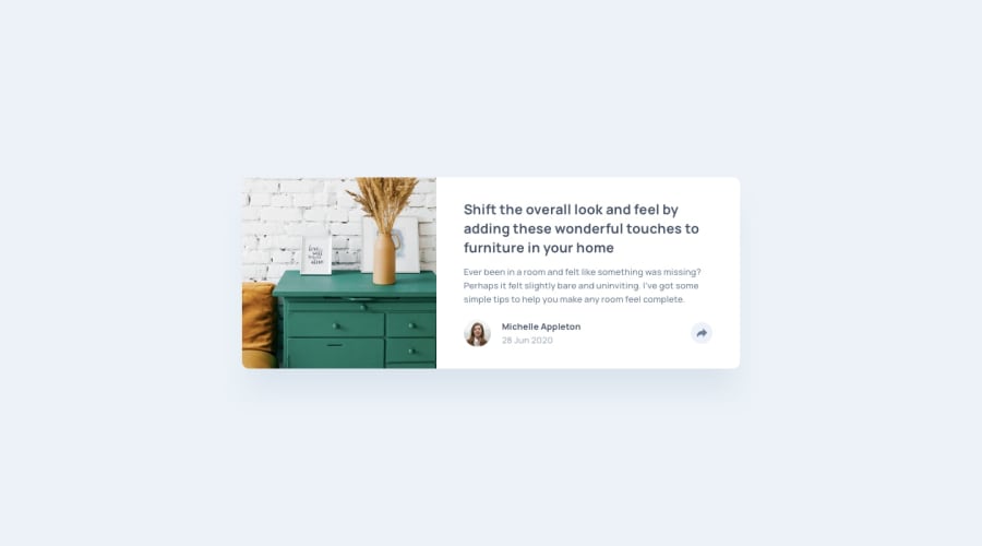
Design comparison
Solution retrospective
Hello~! (≧∇≦)ノ
For this project, I'm still adjusting on using JavaScript and CSS animation, but so far I think I'm improving little by little! But I know that it's still not enough so I will do my best!
If you have any feedback or suggestions, please do let me know! Thank you so much.
Community feedback
- @osoriodevPosted almost 3 years ago
Hello there.
I suggest you use a button element for the share option and put the icon inside, same for social media icons, it is better to use a tags and put the icons inside. This for better accessibility and semantic HTML.
Don't forget to use the aria-label attribute as there is no discernible text.
2 - @NinjaAniketPosted almost 3 years ago
Hi , 1.Background color on the card in the design is white but in your design it seems to be light blue 2.Image seems to be too big when compated to the design 3.Also the margin between user name(michelle) and top sections seems to be too big.
overall good job!
1 - Account deleted
sana all 😊
1
Please log in to post a comment
Log in with GitHubJoin our Discord community
Join thousands of Frontend Mentor community members taking the challenges, sharing resources, helping each other, and chatting about all things front-end!
Join our Discord
