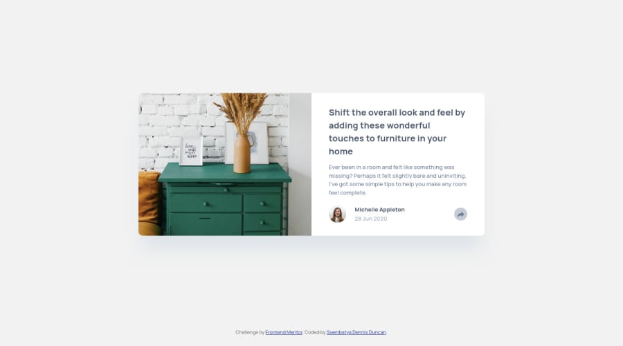
Responsive Article preview component with CSS Flexbox


Design comparison

Solution retrospective
Hi everyone 👋🏽,
I'm glad to have finished this challenge, However It took me some good time to get it ready. Am trying to break the JavaScript knowledge gap barrier but am really getting a tough time crossing the bridge. I honestly welcome any feedback on the weak areas in my solution and how I can improve.
Community feedback
- @amalkarimPosted over 2 years ago
Hi Ssembatya,
Congratulations for your submission! And for crossing the JavaScript bridge too.
I just want to share some of my css personal view regarding your solution.
For the breakpoints, I think it's better to use
max-width: 768pxinstead ofmax-width: 425px. Because when the browser width is close to 425px, the height of<div class="card__details"></div>is taller than thecard__image, which makes the white spaces above and below it.Try to give the
<main>elementpadding-leftandpadding-rightto give a nice breathing space for<div class="card">element.Give your
<div class="card">elementmax-widththat is less than browser width so it won't get zoomed out when the browser width is less than the card'smax-width.Feel free to take a look at my solution here to see how I've done it. Please note that it's far from perfect though.
Hope this helps.
Best regards
Marked as helpful0@ssembatya-dennisPosted over 2 years ago@amalkarim Thank you very much for this wonderful feedback, and it definitely helped.
0

Please log in to post a comment
Log in with GitHub
Join our Discord community
Join thousands of Frontend Mentor community members taking the challenges, sharing resources, helping each other, and chatting about all things front-end!
Join our Discord