Submitted 7 months ago
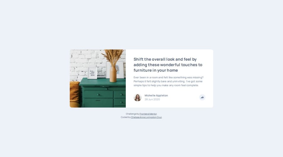
Responsive Article Preview Component using React
#react#accessibility
P
@chelsea-here
Design comparison
SolutionDesign
Solution retrospective
What are you most proud of, and what would you do differently next time?
I'm proud that I was able to figure out how to set up the pop up so that it had a relative position to the items the styling was based around.
What challenges did you encounter, and how did you overcome them?Getting the styling to be correct was challenging, even after I figured out where to position the pop-up components. I ended up handling the view width aspect with css @ media instead of complicating my react component.
What specific areas of your project would you like help with?I'm always looking for ways to simplify my code. If you have ideas on how to simplify my SharePopUp CSS would love to hear about it!
Community feedback
Please log in to post a comment
Log in with GitHubJoin our Discord community
Join thousands of Frontend Mentor community members taking the challenges, sharing resources, helping each other, and chatting about all things front-end!
Join our Discord
