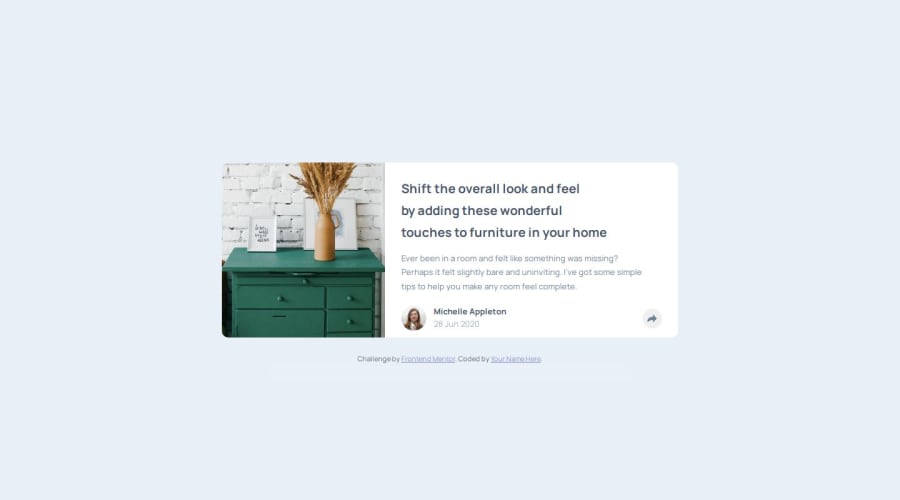
Responsive Article Preview Component using Flex
Design comparison
Solution retrospective
I am proud of figuring out the functionality without needing to be shown the process via a youtube video or other tutorial. I think I would have been more successful if I spent more time planning before diving into coding. I started with the mobile view, but later had to rewrite code and make a ton of adjustments that I could have avoided if I had spent more time planning the skeleton of the project for all screen sizes.
What challenges did you encounter, and how did you overcome them?My biggest issue was getting the active view on desktop and mobile to look right at the same time. I'm going to keep working on it and figure out how to get the view to switch if the screen size changes after the button has been clicked, but I haven't figured out how to fix that problem just yet.
What specific areas of your project would you like help with?Right now, if you click the share button and then adjust the browser width from less 730px to greater than 730px or vice versa, the active state doesn't change to the mobile or desktop view along with the rest of the layout. I created a function to track the current browser width, but my attempts to use an if/else statement to update the active state have failed. Any tips or pointers would be greatly appreciated!
Community feedback
Please log in to post a comment
Log in with GitHubJoin our Discord community
Join thousands of Frontend Mentor community members taking the challenges, sharing resources, helping each other, and chatting about all things front-end!
Join our Discord
