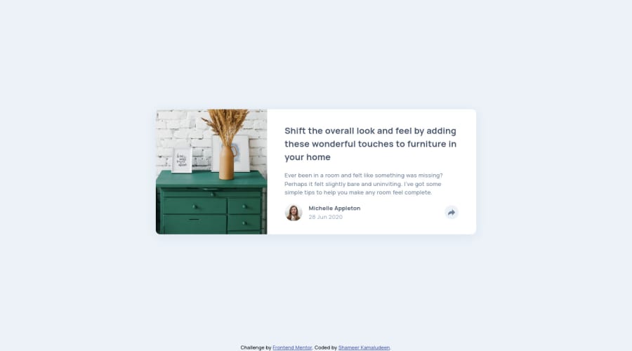
Responsive article preview component solution using flexbox
Design comparison
Solution retrospective
Any suggestion is valuable...
I want to be clear when choosing the structure of the document, what actually happens is placing elements wrongly cause some of the designing to become not possible and that makes rewriting CSS as well as HTML which ends up in hefty time to finish the project.
I know it's a learning period and it happens, can someone help with the issue talked above, how I can improve on that?
Community feedback
- @jgengo-altPosted over 2 years ago
Hello there!
Well, you nailed it to me! It works as expected except maybe for the mobile version, the "share button" doesn't toggle back the share tooltip. but if I click anywhere else that the share menu it dropdown the tooltip, so it is actually UX-friendly for mobile usage :) Good job!
When it comes to structure of the document or your css, it will comes with experience by doing more and more of them. You will sharpen your eyes and be able to notice at first sight what gonna be easy what gonna be complicated, how things should be done and what kind of pitfall you should avoid :)
keep going! you did great!
Marked as helpful1
Please log in to post a comment
Log in with GitHubJoin our Discord community
Join thousands of Frontend Mentor community members taking the challenges, sharing resources, helping each other, and chatting about all things front-end!
Join our Discord
