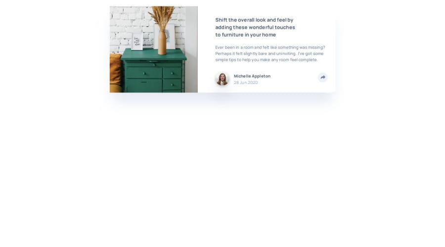


Design comparison

Solution retrospective
I am most proud of the JavaScript functionality and the CSS popup on the desktop version of the site. The small pointer shape at the bottom of the pop-up window was a learning experience for me.
What challenges did you encounter, and how did you overcome them?There were a few things I had to look up both for my CSS and JavaScript but I was able to complete the entire project. It was a great learning experience.
Community feedback
- P@kodan96Posted 10 months ago
@media (min-width: 930px)
body {
    min-height: 100vh;
    display: flex;
    flex-direction: row;
    justify-content: center;
    align-items: center;
    /* width: 730px; */
    /* height: 280px; */
}

body {
    /* outline: 2px solid darkblue; */
    display: flex;
    flex-direction: column;
    align-items: center;
    /* width: 327px; */
    /* height: 512px; */
    /* margin: 20px auto; */
    background: #ffffff;
    box-shadow: 0px 40px 40px -10px rgba(201, 213, 225, 0.503415);
    border-radius: 10px;
}
remove the lines that has /* */ around them
your layout will fall apart on smaller screens, because you applied fixed width on your elements. If you want to resolve the issue just let the child elements determine the width of the container, you can still apply padding to it, so you get the desired design
also wrap your entire element in a container div, so you can give the body a background color, separating it from your element.
Marked as helpful0@rtoddmPosted 10 months ago@kodan96,
Your responses are very helpful! Thank you! I am still stumbling my through this coding thing so let me clarify a couple two points if you don't mind.
First, are you suggesting not having fixed widths on any of the code or just specifically on the mobile section?
Second, are you suggesting that I have one HTML tag (e.g. a div element) that is the child element of the body tag and which wraps all of the other elements of the page?
Again, thanks so much for the helpful feedback!
0P@kodan96Posted 10 months ago@rtoddm
to your first question: it's generally not a good practice to define width to your elements, especially not by defining them with hard-coded values (pixels). they'll adapt to their content's size by default. if you want to control their size you can use
max-width. you can even combine it with thewidthproperty:.element { width: 90%; max-width: 60rem; }here
.elementwill take up 90% of its container's width, but when it reaches the 60rem width it won't expand anymore.second question: yes, like this:
<body>
  <div class="container">
     <---------------------All your content goes here--------------------------->
  </div>    <---------------closing tag of .container
</body>
this way you can apply
display: flex;to the container element and, give it padding and you are more or less good to goMarked as helpful0@rtoddmPosted 10 months ago@kodan96
That's very clear and helpful!! Thanks for taking the time to offer all of that feedback!
1 - P@kodan96Posted 10 months ago
hi there! 👋
You can center your content with Flexbox if you apply these to the
bodytag:body { min-height: 100vh; display: flex; justify-content: center; align-items: center; }note that if you wanna do the same for bigger projects that has more elements you should also apply
flex-direction: column;to the same tagHope this was helpful 🙏
Good luck and happy coding! 🙌
Marked as helpful0@rtoddmPosted 10 months agoHi @kodan96,
Your suggestion is quite helpful. In fact, that was a question I meant to ask when I was uploading my solution. However, when I add that chunk of code (specifically the min-height property) it causes the body of the page to stretch out as opposed to simply centering. I'm sure I've made a mistake somewhere else in my CSS as well but any advice you could offer on how to fix that would be super helpful. You can see this problem if you take a look at my site once again.
Thanks so much!
0

Please log in to post a comment
Log in with GitHub
Join our Discord community
Join thousands of Frontend Mentor community members taking the challenges, sharing resources, helping each other, and chatting about all things front-end!
Join our Discord