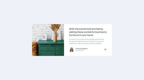
Responsive Article Preview Component HTML , CSS, JS

Solution retrospective
The main challenge here was positioning my share pop-up. I used a combination of relative and absolute positioning, as well as adapting content with different techniques as my design breaks using media queries.
What specific areas of your project would you like help with?Best approaches to position the share pop up and aligning the share button, since my solution was just to set a bigger height to cover the whole profile and button, so share looks centered, that being said when viewport becomes smaller, it will shift and look uncentered again unless you repositioning with translate or something.
Would like to hear your solutions or best practices
Please log in to post a comment
Log in with GitHubCommunity feedback
No feedback yet. Be the first to give feedback on Dangelo's solution.
Join our Discord community
Join thousands of Frontend Mentor community members taking the challenges, sharing resources, helping each other, and chatting about all things front-end!
Join our Discord