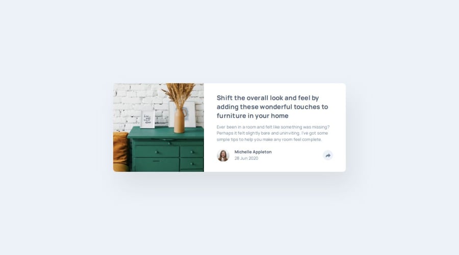
Design comparison
Solution retrospective
Still unsure which approach is best...desktop => mobile or the other way around.
Have been approaching it this way and not sure if I am making extra lines of css code because of it but I find I gravitate to this approach more.
Next project, I'll be trying mobile first approach.
What challenges did you encounter, and how did you overcome them?No mega issues popped up, which I am really happy about :)
What specific areas of your project would you like help with?I don't think it's a super big deal, but I can never get the shadow correct.
Is there a way? Or is it just estimating?
Community feedback
- @Sheikh-MussadiqPosted 11 months ago
Nice I liked your solution. But I want to know how you changed the color of the share icon to white when clicked. Also, you can check my solution and help me with the share button mobile design
0@brainkaPosted 11 months agoHey @Sheikh-Mussadiq,
One way of resolving your issue (and how I approached it) is:
-
Remove
<img src="./images/icon-share.svg" alt="share">from your index.html file. -
Instead replace it with an inline svg for the share icon:
<svg xmlns="http://www.w3.org/2000/svg" width="15" height="13"><path fill="#6E8098" d="M15 6.495L8.766.014V3.88H7.441C3.33 3.88 0 7.039 0 10.936v2.049l.589-.612C2.59 10.294 5.422 9.11 8.39 9.11h.375v3.867L15 6.495z"/></svg> -
Replace the svg attribute fill="#6E8098" to fill="currentColor"
-
Add something like this in your CSS (i am just using random color), :
.clicked { color: yellow; } -
In your script.js add this to your click event listener:
shareBtn.classList.toggle('clicked');
Let me know how you go and if you have any further questions 😀
1 -
Please log in to post a comment
Log in with GitHubJoin our Discord community
Join thousands of Frontend Mentor community members taking the challenges, sharing resources, helping each other, and chatting about all things front-end!
Join our Discord
