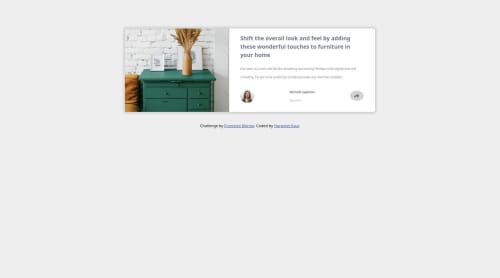
Responsive article preview component

Solution retrospective
I learned to use Jquery via this project and next time I will try to dig deeper into Jquery to further improve my skills.
What challenges did you encounter, and how did you overcome them?I facing alot of troubled with creating the blue bottom for the smaller screen sized but it eventually I was also to solve it by creating two different divs for smaller and wider screens and the styling them differently.
What specific areas of your project would you like help with?Any kind of feedback is useful, it is just that I face alot of trouble with adjusting font size , I think there is something up with the text size setting of my browser because when I make changes in the font size I do not see any differnce hence I do not know how the fonts will appear on others screen.
Please log in to post a comment
Log in with GitHubCommunity feedback
No feedback yet. Be the first to give feedback on hkaur108's solution.
Join our Discord community
Join thousands of Frontend Mentor community members taking the challenges, sharing resources, helping each other, and chatting about all things front-end!
Join our Discord