Submitted over 3 years agoA solution to the Article preview component challenge
Responsive Article Preview Component
@badgujarankush

Solution retrospective
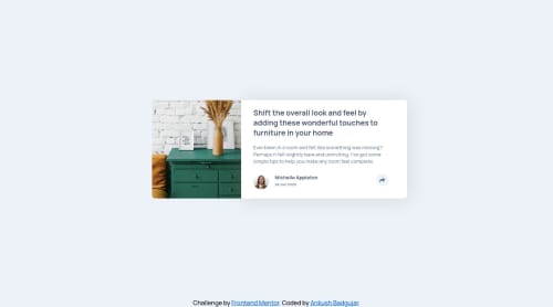
Faced some problem in overlapping the content over image and positioning the share popup div. Tried my best to replicate the design. Any feedback would be helpful to learn about efficient method for positioning of popup card.
Code
Loading...
Please log in to post a comment
Log in with GitHubCommunity feedback
No feedback yet. Be the first to give feedback on Ankush Badgujar's solution.
Join our Discord community
Join thousands of Frontend Mentor community members taking the challenges, sharing resources, helping each other, and chatting about all things front-end!
Join our Discord