

Design comparison

Community feedback
- @khatri2002Posted about 2 months ago
Hi @mittens67!
The developed solution looks great! I have a suggestion worth considering:
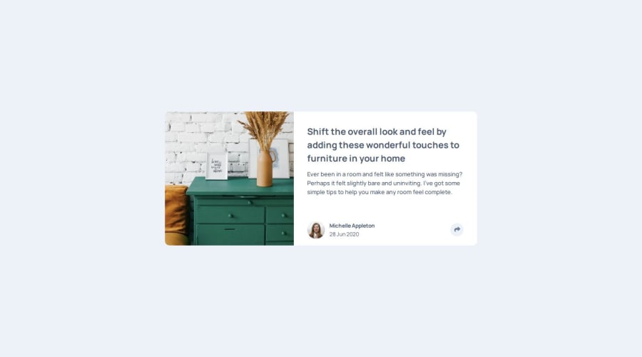
To create the circular shape for the share-icon button, you've used padding:
.card-main__profile-right {
  padding: .5rem .9rem;
}
However, this results in an oval shape rather than a perfect circle. Using padding is not the best approach to achieve a circle. Instead, a more standard method is to assign a fixed width and height and set a large border-radius:
.card-main__profile-right {
  width: 3rem;
  height: 3rem;
  border-radius: 50%;

  // To center align the icon inside
  display: flex;
  justify-content: center;
  align-items: center;
}
This will create a perfect circle. You can now remove the padding to maintain the correct shape.
Additionally, you've wrapped the share icon inside a
divelement and attached the click event to it. Since the element is clickable and triggers an action, abuttonelement would be more appropriate. This is because thebuttonelement semantically indicates an interactive element that performs an action, improving accessibility and usability.The rest of the solution looks great! Keep up the excellent work! 🚀
Marked as helpful0


Please log in to post a comment
Log in with GitHub
Join our Discord community
Join thousands of Frontend Mentor community members taking the challenges, sharing resources, helping each other, and chatting about all things front-end!
Join our Discord