Responsive Article Preview
Design comparison
Solution retrospective
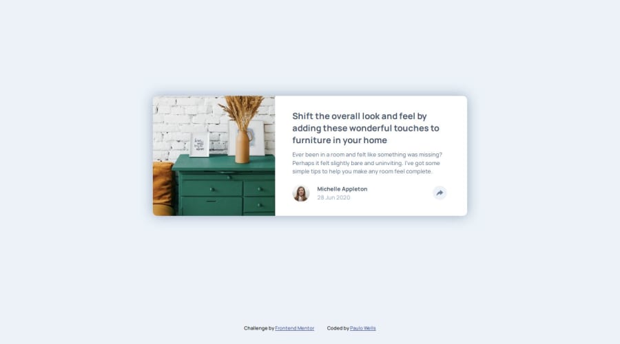
I focused on replicating the original design while adding a third (tablet) view. I searched for the simplest structure that would work nicely on every layout. I also introduced a smooth animation to the Javascript interaction. I'm pretty happy with the result.
What challenges did you encounter, and how did you overcome them?I've put some effort into keeping the code simple and legible;
What specific areas of your project would you like help with?Feedback is welcome!
Community feedback
- P@KonradJamPosted 4 days ago
Hello @wellspr!
Good work. You don't need two share buttons. One when the share component is hidden and one when it is visible. Change the
z-indexfor the share button to be above the share component.1
Please log in to post a comment
Log in with GitHubJoin our Discord community
Join thousands of Frontend Mentor community members taking the challenges, sharing resources, helping each other, and chatting about all things front-end!
Join our Discord
