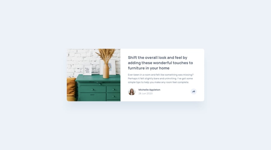
Design comparison
SolutionDesign
Solution retrospective
Give me some feedback to improve my design skills
Community feedback
- @MelvinAguilarPosted 12 months ago
Hello there 👋. Good job on completing the challenge !
Your design looks visually appealing, and you've done a good job overall. However, I have a few suggestions to enhance both the accessibility and structure of your code:
- While using
onClickon a div is technically functional, it's not semantically correct. Adivis a container element, and using it as a clickable item without a clear purpose can be confusing for users, especially those who rely on screen readers. For better accessibility, consider using a<button>element instead. Buttons are designed for interaction and are more accessible.
- For social media icons, it's good practice to use links (
<a>) instead of just images. This allows users with screen readers to understand that these images represent links to social media profiles.
- You should use the
cursor: pointerproperty to indicate that the element like a button or a link is clickable.
I hope you find it useful! 😄
Happy coding!
0 - While using
Please log in to post a comment
Log in with GitHubJoin our Discord community
Join thousands of Frontend Mentor community members taking the challenges, sharing resources, helping each other, and chatting about all things front-end!
Join our Discord
