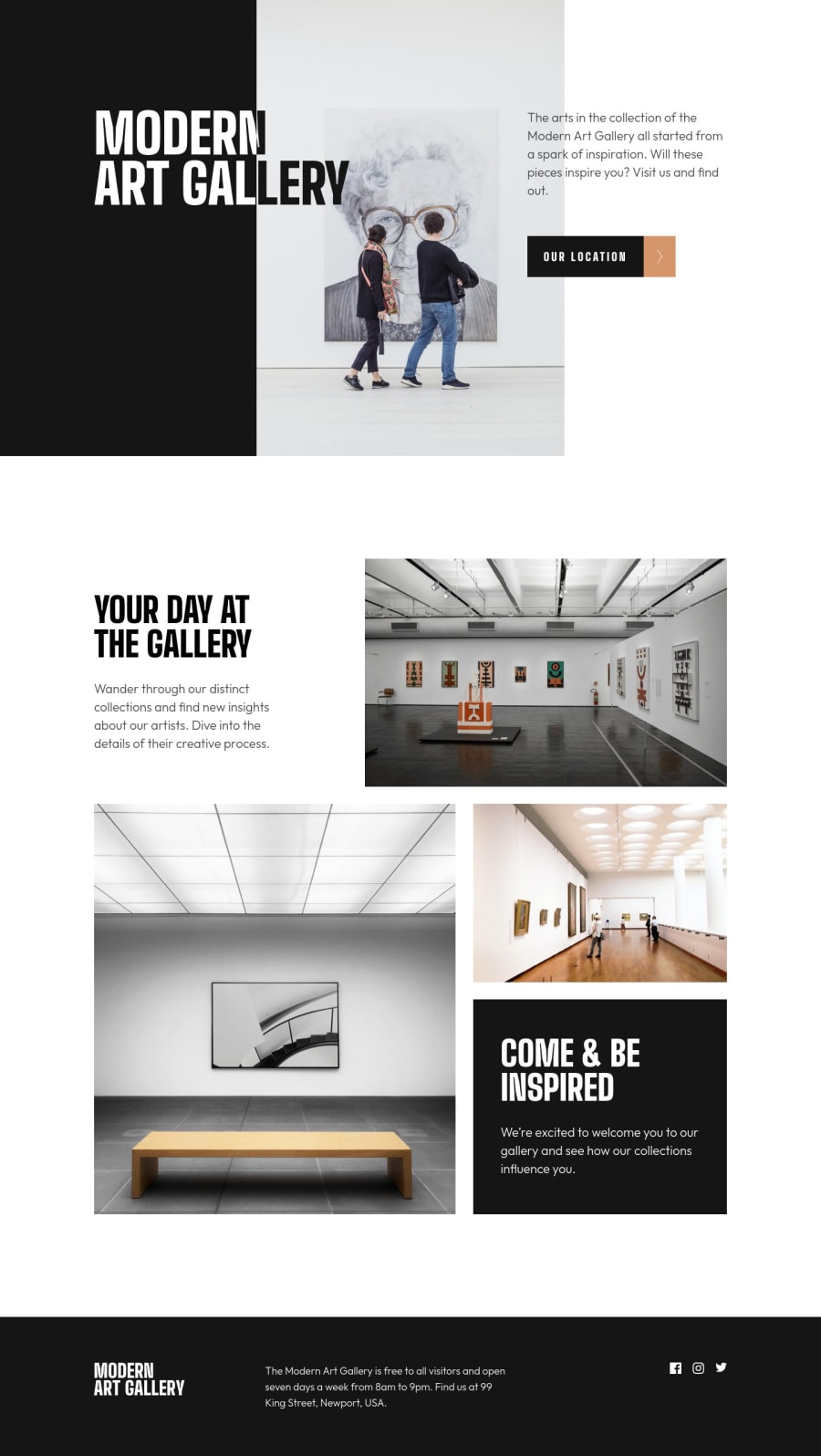
Responsive Art Gallery Website Using React and TailwindCSS
Design comparison
Solution retrospective
Check this out!
Community feedback
- @elaineleungPosted over 2 years ago
Hi Ali, first off, this was done very well! 😊
About the inverted text color in the desktop mode, your solution there in handling the text was very creative, something I wouldn't have thought of. In any case, instead of using
overflow: hiddenwith another text block, what you can try is to usemix-blend-mode. To do this, remove theoverflow: hiddenand also remove the other text block; then in the text div where you hadxl:w-[514px]addmix-blend-mode: difference. If you do that, you'll also see the text blend with the background image, which is something that does not seem to happen in the original design, which could be because they may not have this as a background image. I would suggest using it as a responsive image withpictureorimginstead of abackground-imagesince this image is quite central to the site, and so I'd consider it more as content than background.Anyway, great work on the whole, especially in getting this to look just like the design!
Marked as helpful1@0x41-liPosted over 2 years agoHi Elaine,
First off, let me start by apologizing for the delay to respond to your comment.
Thank you for your suggestions, I really appreciate your time looking at my work.
All your advices were pretty awesome which made me try to apply them while trying to, I did replace the background image with the actual image element, and made it work as the background image was working, and it looks wonderful. Thank you!
But for the mix-blend-property, it did work well, but not as the design, as I need the text to have pure white and almost black colors, and when I tried the property, the text had grey and black color with the image interfering too, and that's the right behavior of the property, but not what the design looks like.
If you had a chance to look at my response, let me know what you think, and if you would like to try out solving this problem. I will work on it too.
Finally, I just wanted to let you know that you're really great at solving problems, plus observations, an amazing rare skill. Keep it up.
1@elaineleungPosted over 2 years ago@0x41-li Hi Ali, thank you so much for the comment, which I greatly appreciate!
Yes, I had a look at the problem you described, which was also what I had noted earlier, and I ended up doing a search for other solutions to see what others came up with. Most of them left that part of the text blended with the image, but there were one or two who used the linear gradient to have half of the text in white and the other half in black. I think that's something you can try as well instead of having two text blocks; you'll probably have to figure out where the color stops are, but yes, this is a possible solution.
I'm not too familiar with Tailwind unfortunately, so troubleshooting was a bit challenging, but in any case, this was a good experience for me as well since I do plan to try this challenge out later!
Marked as helpful0@0x41-liPosted over 2 years agoThank you, Elaine
Your suggestions, all worked very well for me, I learned a lot and implemented the gradient solution, which worked very great. I appreciate your help very much. Keep up the good work.
0
Please log in to post a comment
Log in with GitHubJoin our Discord community
Join thousands of Frontend Mentor community members taking the challenges, sharing resources, helping each other, and chatting about all things front-end!
Join our Discord
