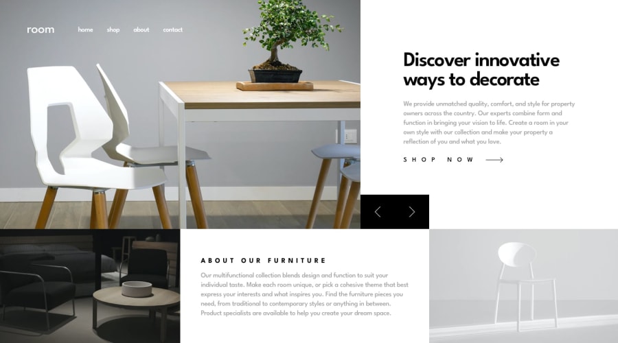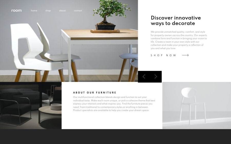
Design comparison
Solution retrospective
In this challenge, I have made some layout/design decisions that I believe have improved the responsive flow a bit.
I have had an issue with a 'side-effect' while implementing fade-in animation on this project, which I described in detail in the README file on my repository link.
Although I have come up with a different solution eventually, I'd appreciate if someone could tell me what specifically could have caused the said side-effect and whether I could have refactored my code to resolve it without adding the extra CSS.
Thanks in advance!
Community feedback
- @isprutfromuaPosted over 2 years ago
Hi there. You did a good job 😎
keep improving your programming skills🛠️
your solution looks great, however, if you want to improve it, you can follow these recommendation:
**HTML**
✅ Use HTML5 semantic elements. Make sure correct use of the HTML5 semantic elements like: header, footer, main, nav, article, section. It’s will help you to write more structured piece of code.
✅ Set a meaningful img alt attribute. It’s best practice for SEO purpose.
✅ Avoid complex wrapping. For better performance please tried to avoid unnecessary wrapping. It will create unnecessary node in your HTML tree and reduce performance too.
✅ Write Code Comments. It’s best practice to write human-readable code. Tried to comment your block of code. It will help you or any other developer to refactor the piece of code blocks.
✅ Do not use divs to create headers and footers – use semantic elements instead. It's advisable to use the <figure> element when adding captions to your images. It is important to use the <figcaption> element along with the <figure> element for it to work.
✅ Follow a consistent HTML format. It is important to remain consistent in your HTML style. You can use prettier to help you with that but the goal is to always follow a consistent way you code your markup.
**CSS**
✅ Use a CSS reset . By default, browsers don’t apply the same default styling to HTML elements, a CSS reset will ensure that all element have no particular style. For example: css-reset
✅ Write consistent CSS. At the beginning part of the project you can set some rules for maintain throughout to your entire stylesheet. If you follow the convention or BEM, you’ll be able to write CSS without being afraid of side effects.
✅ Avoid Extra Selectors. Adding extra selectors won't bring Armageddon or anything of the sort, but they do keep your CSS from being as simple and clean as possible.
✅ Use Clamp . The clamp function make smaller and simple CSS to control element width.
width: clamp(100px, 50%, 300px);
✅ Use CSS Variables . Making the code flexible is equally important so that refactoring won’t be a problem for you. One of the best ways to achieve this is variables.
I hope my feedback will be helpful. You can mark it as useful if so 👍 it is not difficult for you, but I understand that my efforts have been appreciated
Good luck and fun coding 🤝⌨️
Marked as helpful0@Marija-KovPosted over 2 years ago@isprutfromua Hi there, thanks for putting effort into copy-pasting your pre-made cheat-sheet list of suggestions and tips that you use to comment on every solution on FEM, but it didn't cover anything that my question was about.
0@isprutfromuaPosted over 2 years ago@Marija-Kov sorry, but I don't agree with you. Because by following these simple rules you would avoid this problem.
You have a large number of unrelated selectors that are difficult to manage, as well as a number of css rules. All you need to do is turn on the developer tools and you will see that your site don't look as expected on all devices. And you will see that the magic numbers you specified for the slider buttons do not work good. So simply use
position: absolute bottom: 0, top: auto
and remove the /* top: -8em; for the shop button.
I did not describe anything super complicated. Because following the basic rules is the key to a well built site.
0@Marija-KovPosted over 2 years ago@isprutfromua Hi again, alright, I will consider your suggestions and make the most use of them.
I have built the page using Brave dev tools start to finish. I did do my best to make sure that the layout looked the way I wanted on every screen width from 375px up. Also considered different desktop monitor heights. However, I'm now seeing that with Mozilla, the switch button group sits lower - I have noticed some difference in how my layouts look in Mozilla compared to Brave, Chrome, Safari, but never to this extent and I will look into that issue as well.
I did also ask a very specific question about the animation side-effect that I had and your many suggestions contained not a single mention of it, which is why your good intention came across as disingenuous.
Thanks for your response.
0@isprutfromuaPosted over 2 years ago@Marija-Kov hi again. You are right, sometimes it's useful to recheck your final solution in different browser and devices. About your README: I would like to commend you for describing your problems in detail in the repository. I didn't notice them right away, because most (like me) don't describe it at all. About animation and your solution: I think that using a background for a picture element is not the best idea. Following the specifications of picture element, it should contain source and img elements.
Have you tried using the img element with the loading = eager attribute?
or use the link tag with the preload as image attribute?
<link rel="preload" as="image" href="important.png">
Regards
Marked as helpful0@Marija-KovPosted over 2 years ago@isprutfromua I wasn't aware of the specifications for the use of the <picture> element, thanks for that link. I thought that it would be convenient to use background-image attribute instead of adding <img> element because putting an image inside of a picture seemed like excessive wrapping to me at the time, and I actually preferred the result that I was getting otherwise i.e. that the sample image was behaving as a background of an element, not the element itself. I will look deeper into semantic html.
After adding the <img> element inside the <picture>, moving all its attributes to <img> and implementing setAttribute("src", "/img source/") for switching sample images in JS, I found that it just put me back to the beginning with the animation side-effect issue. The loading="eager" on the <img> element didn't work either, nor did <link rel="preload"...> (never used rel="preload" before, I'll have to figure out how to use it effectively), and I think the nav bar and the logo are the ones that are supposed to be loading more eagerly anyway :P I have thought of writing a function that would load the nav bar and logo before anything else on the page, but it's not like the whole page is being reloaded every time the hero image is being switched. I will do more research on this as I figure it will be essential when I have many more image files to work with and it would be ridiculous to create a class for each image.
Regarding the switch button group position issue in the desktop layout, I found that " position: absolute; bottom: 0; top: auto; " just put the button group to the bottom of the page. I had it switched to relative before because I believed I had to find a way to keep it at the bottom-left corner of the article.info (which is also why I wrapped it inside that element). I'll set the padding of article.info to 0 and try going from there.
0@isprutfromuaPosted over 2 years ago@Marija-Kov I guess navbar preloading could be done with animation css delay, no? Another cool things to make this effect is GSAP
0@Marija-KovPosted over 2 years ago@isprutfromua I actually added a high z-index to .logo and nav and solved the animation side-effect :P My hamburger menu icon had a z-index: 88 that I had previously set for a different reason, which is why I had no issues with it in this case. After removing styling from the nav bar links, I noticed that the "disappearing" issue only occurred only in the part of the element that was overlapping with the <picture>. So I set the z-index to 99999 and it worked like a charm.
Cheers
1
Please log in to post a comment
Log in with GitHubJoin our Discord community
Join thousands of Frontend Mentor community members taking the challenges, sharing resources, helping each other, and chatting about all things front-end!
Join our Discord