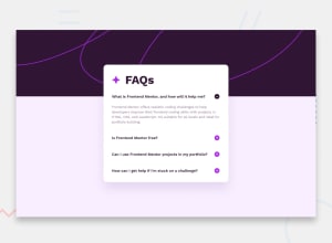
Design comparison
Solution retrospective
Notes:
- Tried to add the star icon as a pseudo-element, but had difficulty scaling and figured it was better to just include it as an img tag.
- Since these icons are just decorative, I didn't include alt tags.
Appreciate any feedback!
Community feedback
- @DeanogitPosted 11 months ago
Hey Jessica
This solution looks great!
I'm just wondering about the use of semantic HTML, would it be better to use a
headerinstead of thedivfor the heading class? I think this could be open for discussionRegarding SEO and Accessibility, if I open up Lighthouse in dev-tools there are some small tasks that could improve the SEO & accessibility score.
For example by giving the
imgalttags but leave it emptyalt=""here & addingmetatags with description & author.Hope this helps
Marked as helpful0@jessicaalinPosted 11 months ago@Deanogit Thank you so much! You're right—I think header makes more sense. And thank you for the alt and meta tags tip! Have a great day :)
1@DeanogitPosted 11 months ago@jessicaalin Thank you for marking my comment as helpful, I'm glad I could contribute to your excellent project :)
0
Please log in to post a comment
Log in with GitHubJoin our Discord community
Join thousands of Frontend Mentor community members taking the challenges, sharing resources, helping each other, and chatting about all things front-end!
Join our Discord
