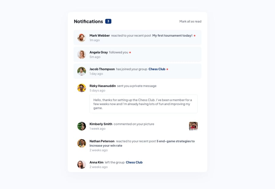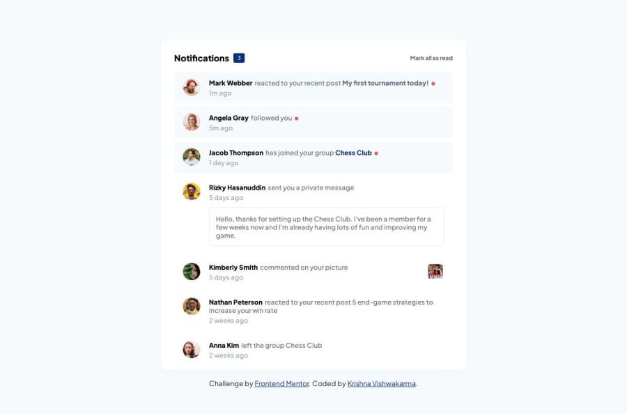
Responsive & Interactive Notification Page using CSS grid and Flexbox
Design comparison
Solution retrospective
Hey, everyone. A new challenge solution with responsive styles and interactive design. Please have a look and let me know of any suggestions! Thanks!
Community feedback
- @MarjanZivkovicPosted over 1 year ago
Hey KRISHNA! Great job on the design! I find it a little strange to completely remove the badge and the button from the DOM once you mark all messages as unread. If that was your goal, it's, fine. If not, there's an easy fix:
//.... let notificationCount = unreadNotifications.length - 1; const onNotificationClick = (notification) => { //... if(notificationCount === 0){ return; } --notificationCount; } //... } ``` You just stop your function once the counter hits 0. Also, you have to move decreasing your counter below the if check so it stops decreasing if it's less than 0. Keep going!
Marked as helpful0@KrishnaVishwakarma1595Posted over 1 year ago@MarjanZivkovic Yeah, that was my goal. I think it's better to hide them cause we've marked them read and no new notification is there. It could be many ways to do this. Thanks for the suggestion, I'll remember this and will change.
1
Please log in to post a comment
Log in with GitHubJoin our Discord community
Join thousands of Frontend Mentor community members taking the challenges, sharing resources, helping each other, and chatting about all things front-end!
Join our Discord