Design comparison
Solution retrospective
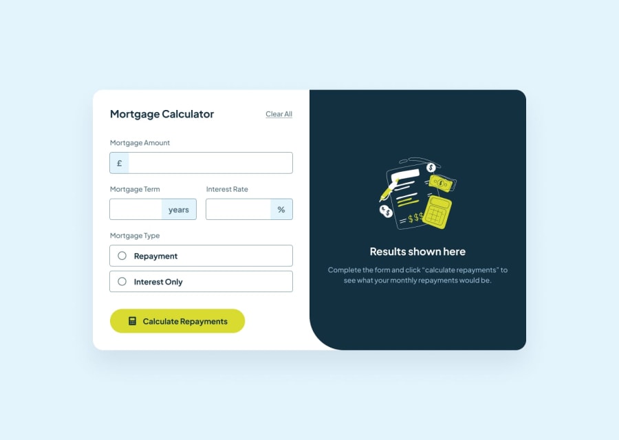
😊😁What an incredible project! I loved working on this one. The design and layout are minimalistic and perfect for the project. When it comes to functionality, some tricky decisions needed to be made, for instance resetting the form without submitting the form which would trigger errors, and "type = button", solved that.
What challenges did you encounter, and how did you overcome them?I now understand how to leverage the useEffect hook as it ensures up-to-date data is being used otherwise if you don't use it state updates may be delayed, leading to incorrect data being rendered.
What specific areas of your project would you like help with?I wonder how to allow users to enter amounts with commas (,) while it won't affect the calculations. This improvement would definitely provide a better UX,
Community feedback
Please log in to post a comment
Log in with GitHubJoin our Discord community
Join thousands of Frontend Mentor community members taking the challenges, sharing resources, helping each other, and chatting about all things front-end!
Join our Discord
