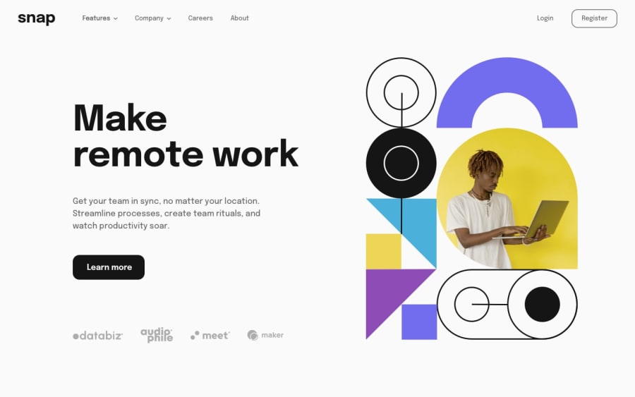
Design comparison
Community feedback
- @kwngptrlPosted over 1 year ago
Hi, nice job on the layout. However, there are some usability issues. For example, when I go into mobile mode and click on the hamburger menu to open it, and then go back to desktop mode, the whole menu container is the mobile one and the gray background is everywhere.
Another is, if I switch into mobile mode press Features or Company, close it, and then go back to desktop, the background is fine, but the whole desktop navbar is gone.
Tip: (Unrelated to the above) For the 'Learn More' button in its normal state, you may want to place a transparent border of x pixels, and then in the hover state just change that border to a different color. This way it eliminates the 'jump' that you see on the SVGs below when you hover on it.
0
Please log in to post a comment
Log in with GitHubJoin our Discord community
Join thousands of Frontend Mentor community members taking the challenges, sharing resources, helping each other, and chatting about all things front-end!
Join our Discord
