Submitted 8 months ago
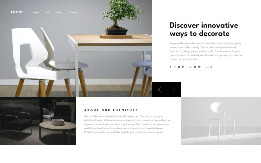
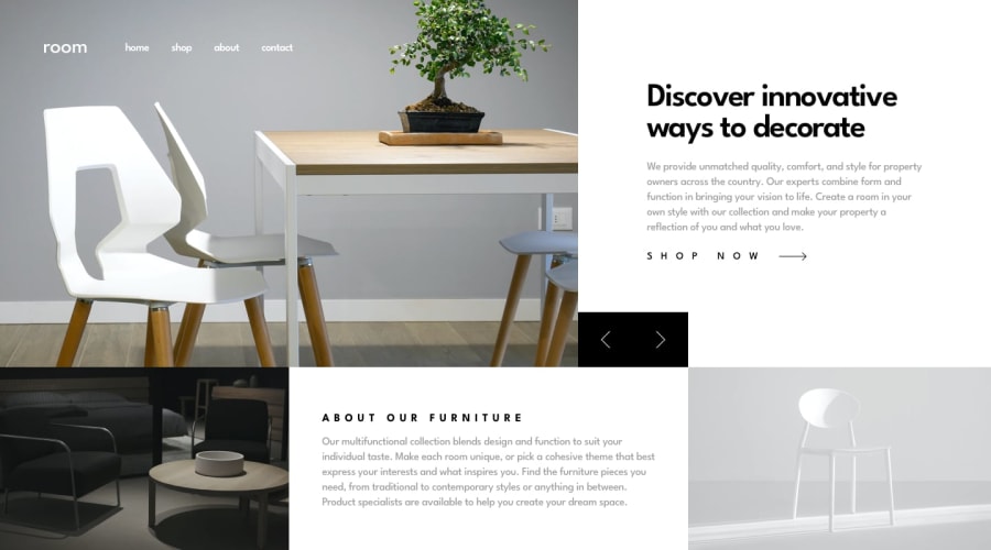
Responsive and Interactive Homepage (with carousel)
#vite#react
@VictorKevz
Design comparison
SolutionDesign
Solution retrospective
What are you most proud of, and what would you do differently next time?
🥂😁This is my second INTERMEDIATE challenge! Learning the carousel logic was very interesting. I'm glad I managed to make use of CSS positioning (I hate it 😬) for some tricky parts like the control buttons. It would have been nice if I had added some animations, which is something I will start looking into soon!
What challenges did you encounter, and how did you overcome them?Funnily, the mobile menu gave me a hard time until I realized all I had to do was use flex-direction of row-reverse 😂.
What specific areas of your project would you like help with?Any feedback is greatly appreciated!
Community feedback
Please log in to post a comment
Log in with GitHubJoin our Discord community
Join thousands of Frontend Mentor community members taking the challenges, sharing resources, helping each other, and chatting about all things front-end!
Join our Discord
