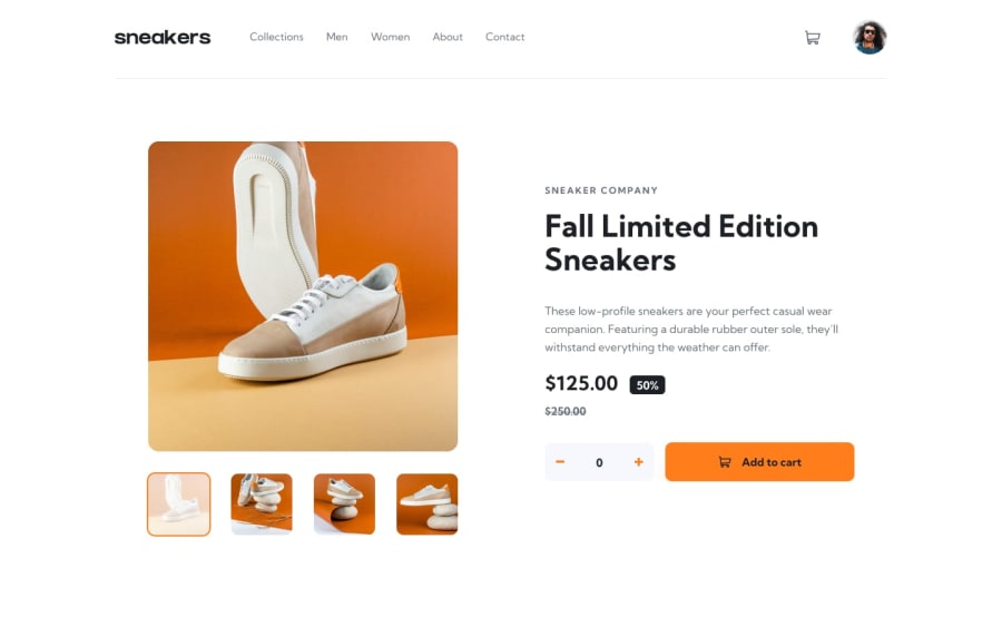
Design comparison
SolutionDesign
Solution retrospective
Any feedback, please?
Community feedback
- @jkellermanPosted about 2 years ago
Hey nice solution 👍
Just some feedback, your products-number element doesn't have a fixed width. When you shrink the viewport the number overflows into the button. You need to change width: 126.6px to min-width: 126.6px.
Also, if you want the text in the button to not go on multiple lines, a little trick is to add 'whitespace: nowrap' to button element.
Hope this helpful.
0
Please log in to post a comment
Log in with GitHubJoin our Discord community
Join thousands of Frontend Mentor community members taking the challenges, sharing resources, helping each other, and chatting about all things front-end!
Join our Discord
