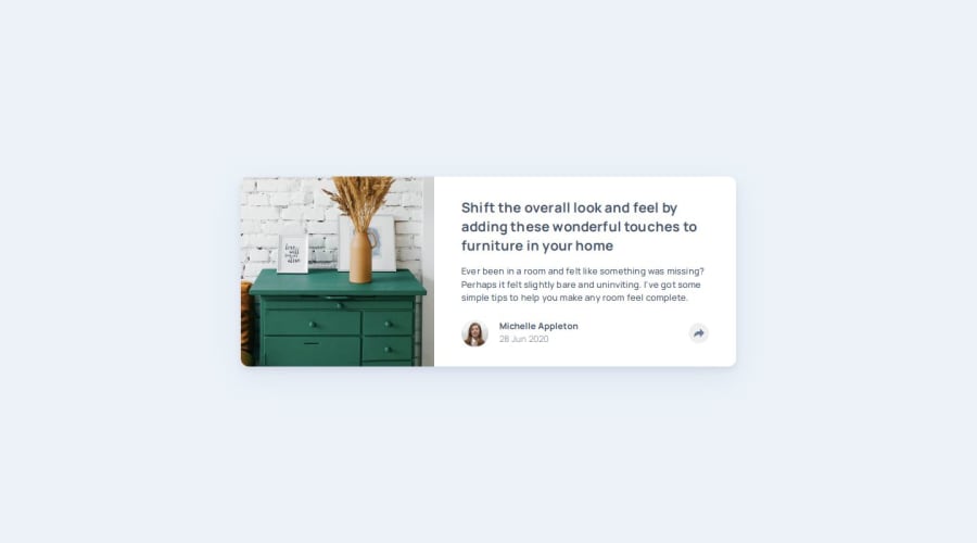
Responsive and Interactive Article Preview Component using JavaScript


Design comparison

Solution retrospective
- Is using of tag
<article>for card semantically correct? - I could not get the images in mobile and desktop views as exactly as they are in design files (They are a little bit zoomed out I guess). Appreciate any suggestions on how to make it happen. I’m using this code for the image:
width: 100%;
height: 100%;
object-fit: cover;
- I tried my best to add aria attributes to social media div & share button. Feel free to point out any errors and suggestions!
Community feedback
- @khatri2002Posted about 2 months ago
Hi @py-code314!
The developed solution looks great! Below are a few suggestions for improvement:
1) Alignment of the share buttons container:
On clicking the share buttons, the box containing the social icons appears on top of the button. This box should be horizontally centered with respect to the button. Currently, you've assigned
leftandbottomvalues to the absolutely positioned box (div with idcard__social):left: 60%; bottom: 115%;The positioning is based on the footer of the card (
card__footerclass), which hasposition: relative. While this might have been done using trial and error, it's not an ideal approach. If the layout of the card changes in the future, these values will need to be adjusted accordingly.A more scalable solution is to create a wrapper div with
position: relativethat contains both the button and the social icons container. This will allow the container to be center-aligned with respect to the button, without the need for hardcoded positioning.<div class="wrapper"> <button>...</button> <div class="container"></div> </div>.wrapper { position: relative; } .container { position: absolute; left: 50%; transform: translateX(-50%); }This method will ensure that the container is always horizontally centered with respect to the button. It’s a more robust approach.
I understand that you made the footer of the card relative to align the box with respect to the entire card for mobile resolution, but you can manage this via CSS media queries. At a specific breakpoint, you can change the wrapper's
positionfrom relative to static, and make the footer of the card relative. This way, the box will align with the card on mobile, and still center properly on desktop.2) Image on desktop:
On desktop resolution, the "drawers" image is assigned:
object-fit: cover;This will ensure that the image keeps its aspect ratio, cropping equally from both sides if necessary. However, based on the design reference, the image should be cropped only from the right side, not the left. To achieve this, use:
object-position: left;This will ensure the image is aligned according to the design's intended crop.
The rest of the solution looks fantastic! Keep up the great work! 🚀
Marked as helpful1@py-code314Posted about 2 months ago@khatri2002
Thank you so much for your help 🙏🏼
I tried to position the Social media container relative to Share button but couldn't figure it out. Your advice certainly helped me with that 😊
I was also able to position the 'drawers' image exactly like in the design files in both mobile and desktop views using
object-positionpropertyCheers!!
1

Please log in to post a comment
Log in with GitHub
Join our Discord community
Join thousands of Frontend Mentor community members taking the challenges, sharing resources, helping each other, and chatting about all things front-end!
Join our Discord