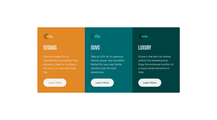
Design comparison
Solution retrospective
Hey! A couple of questions if you can help me, thanks!:
-
Is there any shadow applied to the buttons on the example? I couldn't see it properly from the jpg.
-
The accesibility report says that should be an h1 in this page, but what we should use as it? I've used h2 for the names of the cars.
Community feedback
- @VCaramesPosted about 2 years ago
Hey there!👋 Here are some suggestions to help improve your code:
Regarding you questions:
- There is no shadow.
- The report is designed for a "full sites". It can't tell that this is just a component. The way you did it, is correct.
-
The purpose of the Main Element is to identify the main content of your page. It is not the container of you component. After the main element, you want add a container to wrap you separate components in.
-
The car images/icons in this component are purely decorative; They add no value. So their Alt Tag should left blank and have an aria-hidden=“true” to hides them from assistive technology.
If you have any questions or need further clarification, let me know.
Happy Coding! 👻🎃
Marked as helpful2@CarmendelberPosted about 2 years ago@vcarames Thanks for your comment!! btw, could sections be used as containers then?
0@VCaramesPosted about 2 years ago@Carmendelber
The section element would work, but I would suggest using the article element instead. Since this component is like a "flyer", it makes sense on its own and can be used on other sites, so the article elements make more sense.
Marked as helpful0
Please log in to post a comment
Log in with GitHubJoin our Discord community
Join thousands of Frontend Mentor community members taking the challenges, sharing resources, helping each other, and chatting about all things front-end!
Join our Discord