
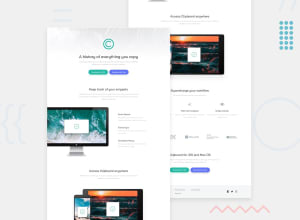
Responsive and Built with Html5, CSS, FlexBox and Mobile-first

Design comparison

Solution retrospective
I still have issues with having enough space at the bottom at different screen sizes. Any suggestion would be nice. Thanks.
Community feedback
- @thisisharsh7Posted about 2 years ago
Hey Macaulay, Good work! your solution looks awesome. In order to answer your query regarding enough space at the bottom at different screen sizes, I go through your solution CSS code and I found
padding-bottom: 100%;in thebodytag andpadding-bottom: 6em;again inbodywith media query at700px. I suggest you to remove these because they are creating extra blank spaces at the bottom and affecting the overall design of the webpage.I hope this clears your issue..
Marked as helpful0@MacChristoPosted about 2 years ago@thisisharsh7 I get what you are saying. But when I view the solution in devices with fixed heights, without those padding-bottoms, some contents usually get cut off at the bottom. Like a device with(width:375px, Height:548px), it displays all content. Then in maybe(width: 375px, height: 700px), the bottom content get cut off at 100% zoom. And the only way it will show full content is to zoom out on your device. That's the reason I always add those padding-bottoms.
0 - @tiago-jv0Posted about 2 years ago
Hello Macaulay, great job solving this challenge, here are some tips that you can use to improve your code :
- Your page should have only one
h1tag, you should take a moment to consider about the relevance of your texts and give them a properly use of the HTML tags - Give a chance to the BEM methodology, it will help you and others understand the context in which elements are being used and about its styling and possible states
- Improve your SEO by using correct landmarks to better match your content sections, I really like that you've used main and footer, however, you should separte the sections of your website with the section tag
Great Job and continue coding, you will be a great developer in the future!
Marked as helpful0 - Your page should have only one


Please log in to post a comment
Log in with GitHub
Join our Discord community
Join thousands of Frontend Mentor community members taking the challenges, sharing resources, helping each other, and chatting about all things front-end!
Join our Discord