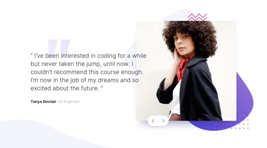
Design comparison
Solution retrospective
If you can't access the netlify site, please use this alternative link.
This is the first time I made a slideshow!
I went back to my solution and updated the slider to notify screen readers whenever buttons are pressed. I also used aria-hidden to only let the screen readers read the currently viewed slide.
Community feedback
- @NehalSahu8055Posted over 1 year ago
Hello Coder 👋.
Congratulations on successfully completing the challenge! 🎉
Just a little suggestion.
➨ Give break-point(media-query for below 900px) as in my laptop mobile version is visible.
I hope you find this helpful.
Happy coding😄
Marked as helpful1@GioCuraPosted over 1 year ago@NehalSahu8055
Hi! Thanks for the suggestion. I did make a breakpoint for tablets and similarly small screens from
768pxto1315px, which increases the size of the images and the font. I planned on having an earlier breakpoint for the "desktop version" but, in my opinion, the text overlaps too much with the image, making it hard to read.update: I made a new breakpoint which starts the desktop layout style from
1024px. Thanks! 👍1
Please log in to post a comment
Log in with GitHubJoin our Discord community
Join thousands of Frontend Mentor community members taking the challenges, sharing resources, helping each other, and chatting about all things front-end!
Join our Discord
