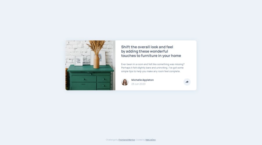
Responsive & Animated Article Preview Component
Design comparison
Solution retrospective
That i managed to display the share menu with just a little bit of javascript and found a nice & pure-css-solution for displaying the menu differently on mobile devices and larger screens.
What challenges did you encounter, and how did you overcome them?There were no real challenges. But I worked a little too intensively on the styling and animations and therefore exceeded the set schedule a little.
Community feedback
- @AdrianoEscarabotePosted about 2 months ago
Hi Martin Liesche, how’s everything? I think your project turned out great! However, I have some feedback that I think might be useful:
Since this project is only based on a single page component, there is no need for a h1 tag. It's always a good idea to prevent accessibility errors, so I believe it would be beneficial for you to add a "h1" in this component. Don't worry if you forget about "h1," though; it's a good practice for when you are developing larger sites.
<h1>Article preview component</h1>Consider using
remfor font sizes. When font sizes are set in absolute units like pixels, users can't adjust the text size based on their preferences. Relative units likeremadapt to the screen size and user settings, making them more flexible across various devices.If you'd rather keep using
px, you can download a handy VS Code extension that converts pixels toremautomaticallylink -> px to rem
The rest is amazing.
I hope this is helpful. 👍
0
Please log in to post a comment
Log in with GitHubJoin our Discord community
Join thousands of Frontend Mentor community members taking the challenges, sharing resources, helping each other, and chatting about all things front-end!
Join our Discord
