Submitted about 2 years ago
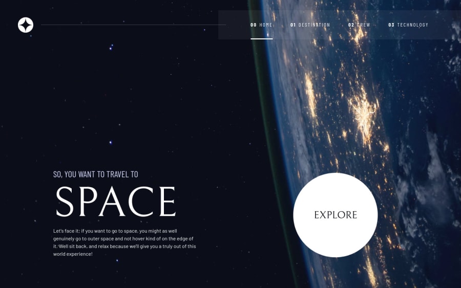
Responsive and Accessible Space Tourism Site
#accessibility
@theidriselijah
Design comparison
SolutionDesign
Solution retrospective
What I found most difficult was cross browser support for certain properties. For example, the primary navigation looks like glass in chrome, and edge, but in safari it was white and ugly, and I couldn't figure out what to do to make the mobile and desktop versions of the app look good in safari.
Please log in to post a comment
Log in with GitHubCommunity feedback
No feedback yet. Be the first to give feedback on Idris Elijah's solution.
Join our Discord community
Join thousands of Frontend Mentor community members taking the challenges, sharing resources, helping each other, and chatting about all things front-end!
Join our Discord
